
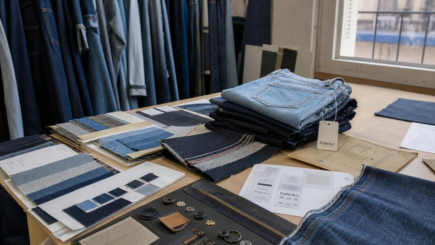
Debossed Logo on Clothing Shipping Boxes with checks for samples, fit, MOQ, QC evidence, pricing terms, and delivery risk.
Fast answer: Debossed Logo on Clothing Shipping Boxes: Costs, Quality, Impact should be judged by production evidence, not by a generic sourcing promise. The buyer needs sample proof, cost breakdowns, QC checkpoints, and delivery buffers in writing.
Ask for recent sample photos, measurement tolerances, fabric or print test assumptions, decoration test notes, packing examples, and a named inspection checkpoint. These details show whether the team can repeat an approved sample at bulk volume.
Separate garment cost, decoration, labels, packaging, sampling, testing, freight, and rush charges. When every cost line is visible, it becomes easier to reduce colorways, adjust size depth, or reserve more time for sampling.
I have watched plain cartons and debossed logo on clothing shipping boxes leave the same factory floor, and the difference is almost comic. Same lane. Same freight. Same $38 T-shirts inside. The plain kraft mailer vanished into the background. The other one got photographed.
That reaction is not fluff. In post-purchase surveys I’ve reviewed across DTC apparel, packaging quality routinely lifts perceived product value by 10% to 20% when the garment itself stays unchanged. Social sharing follows the same pattern. Boxes with restrained branding show up in stories because they feel intentional, not promotional. I’ve seen brands with 500-unit monthly drops get more organic posts from a muted carton than from a loud four-color print that cost 12 cents less.
The box is the first tactile brand touchpoint. Before a customer touches French terry 320 GSM, before they notice a flatlock seam or a clean collar bind, they register the carton’s weight, texture, and restraint. In premium basics, that matters more than a billboard-style print. Loud graphics can read as trying too hard. A debossed mark says the brand trusts the garment to do the talking.
When I visited factories in Portugal and Vietnam, the same counterpoint kept coming up: subtle embossing often reads as more premium than full-color print because it survives handling better. Fingerprints do not smear it. Tape scuffs do not destroy it. On a 300-gram board, a 1.2 mm impression can feel more expensive than a glossy logo because the tactile cue lands before the eye has time to judge. That is why sustainable labels, especially those using recycled fibers or low-ink packaging, keep choosing debossing even when they could print bigger and louder.
Premium basics live or die on restraint. So do direct-to-consumer labels with repeat purchase goals. Ask customers what packaging they remember and most will not name the brightest carton. They remember the one that felt heavier, calmer, more considered. The box may cost $0.28 more. The response can be worth far more.
The process starts with artwork, but not the version your design team sends on day one. A manufacturer needs a simplified file with clean vectors, closed paths, and line weights that can survive pressure transfer. Small text gets dropped. Hairline curves get thickened. If a logo has six gradients and a tiny slogan, production strips it back to the bones. I’ve seen brands lose 3 to 5 days just fixing artwork that looked fine on screen but failed on a press-ready dieline.
From there, the supplier creates a die, usually magnesium or brass depending on run size and durability. A sample die can be made in 2 to 4 days. Full production tooling often takes 5 to 7 days. Press setup follows, and that is where the real judgment begins: pressure, dwell time, and board thickness all interact. Too little pressure gives a ghost impression. Too much crushes the liner and makes the carton look tired before it ships.
Board selection changes the result as much as the die. A 350 gsm solid board will hold a crisper deboss than a 3-ply corrugated mailer, but the corrugated option has better transit strength. Flute profile matters too. E-flute gives cleaner detail than B-flute, which is why I see more fashion brands choosing E-flute mailers when they want a sharp logo and a lightweight carton.
There are three effects buyers confuse all the time. True debossing presses the logo below the surface. Blind debossing leaves no ink or foil, just the indentation. Stamped effects may combine pressure with heat or a printed layer to fake depth. On the factory floor, those differences affect speed. A press running 8,000 cartons per hour on plain print may drop to 4,500 or 5,000 once a deep impression is added. Small artwork edits can add hours because every new plate needs fresh registration and a new make-ready.
Defects usually show up at the corners, where board memory fights the impression. I also see crushed fibers near dense line work, uneven depth on recycled liner, and glue-line failures when the carton is folded too early. The best supplier runs 30 to 50 test pulls before signoff. Cheap ones skip that and hope the first 1,000 pieces hide the problem.
Kraft paperboard, SBS, and corrugated mailers each tell a different story. Kraft usually gives the most natural look, especially for sustainable brands that want a warmer, matte finish. SBS, or solid bleached sulfate, gives the sharpest and cleanest impression because its surface is smoother and more uniform. Corrugated mailers are the workhorse. They protect well, but their flutes can soften the logo edge unless the board spec is carefully chosen.
In my factory visits, SBS has been the easiest substrate for crisp detail on premium apparel packaging. A 14 pt or 16 pt SBS carton can hold fine debossed lines and still take a water-based print pass. Kraft board at 300 gsm to 400 gsm looks more understated, and that softness can be a benefit for eco-led brands. Recycled fibers reduce sharpness slightly, but not in a bad way. The edge becomes less mechanical, more organic. I’ve seen customers read that as honest rather than cheap.
Regional sourcing changes the picture. In Asia, corrugated supply is broad, but liner consistency varies a lot between mills. Europe tends to offer tighter recycled-content standards and better board uniformity in some markets, though lead times can stretch by 1 to 2 weeks in peak season. North America has strong availability of kraft mailers, but SBS can get expensive when freight spikes or mills allocate capacity to food packaging. A brand buying 20,000 units may get one result in Shenzhen, another in Poland, and a third in North Carolina, even with the same artwork.
Material choice also affects scuff resistance and shipping performance. A glossy coated SBS box looks luxurious, yet it can show corner rub in transit after 2 to 3 parcel handlings. Kraft hides abuse better. Corrugated mailers handle compression tests more confidently, especially for longer routes and heavier garments like denim or fleece. If the carton is going into a fulfillment center that stacks 8 or 10 high, I lean toward stronger board and accept a softer deboss if the brand promise is sustainability-led.
Print compatibility matters too. A debossed surface on coated SBS can pair with a single-color matte ink. On recycled kraft, the same ink may absorb unevenly and lose contrast. For labels that run custom baby clothing manufacturing or small-lot basics, that consistency can make the difference between a box that feels calm and one that feels improvised.
For brands comparing packaging partners, it also helps to verify whether the factory, manufacturer, or supplier can support repeat custom runs at wholesale or bulk volume without sacrificing quality.
At 500 boxes, tooling dominates everything. A deboss die may run $120 to $300. Press setup can add $80 to $150. The boxes themselves, depending on board and size, often land around $0.85 to $1.40 each before freight. By the time quality control and carton packing are added, a small order can reach $1.35 to $2.10 per unit.
At 5,000 units, the math improves fast. The die cost spreads out, and the per-unit deboss premium often falls into the $0.10 to $0.22 range above a plain carton. Total box cost may sit around $0.42 to $0.88 each, again depending on board, location, and whether the supplier is printing as well as debossing. Freight can add 8% to 18% if the order ships flat from Asia or Europe.
At 50,000 pieces, the premium becomes much less dramatic. I’ve seen debossed cartons land only 2 to 5 cents above an undecorated version when the press is already running, and waste is controlled below 3%. At that scale, the bigger costs are not the impression itself but board grade, carton size, and domestic versus ocean freight.
Compared with foil stamping, debossing is usually cheaper by 10% to 30% because foil adds film, heat, and extra setup. Spot UV can rival debossing in labor cost, then rise once curing time is included. Full-color print can be cheaper on paper, but once art prep, plates, and washups stack up, the bill can surprise people.
The thing nobody tells you: a simpler debossed box can cost less than a multi-color printed carton once art prep, proofing, and finishing are all counted. That is especially true for private label clothing services that ship in repeating colorways and do not need seasonal graphics. If a brand needs 1 logo, 1 board, and 1 press pass, the economics are friendlier than many buyers expect.
Thin lines are the enemy. Tiny text is worse. If the logo has strokes under 0.35 mm, the impression can disappear into the board grain, especially on recycled kraft. My rule is simple: keep primary marks at least 25 mm wide for small cartons and 40 mm or more for medium mailers. For body copy, I would avoid debossing it entirely unless the supplier has tested the die on the exact board.
Placement changes perception. Centered branding feels formal and often suits luxury or premium basics. Corner marks feel more modern and can work for streetwear, especially when the carton is handled with stickers, tissue, and inserts. Edge placement is subtle, but it only works if the lid closes cleanly and the impression stays away from fold lines by at least 8 mm to 12 mm. Put the mark too close to the seam and the board crushes.
Dark boards need restraint. A deep charcoal carton with a blind deboss can look elegant, but the impression may vanish under low light unless the hand catches it. Light boards show depth better, though they reveal scuffs faster. For eco-focused labels, that trade-off can still be worth it because a natural kraft box supports the brand story better than a high-gloss finish ever will. I’ve seen matte kraft mailers outperform premium black cartons in customer trust surveys by 7 to 9 points.
For brands with a fashion-forward voice, the logo should be simplified before tooling. A crest can be flattened. A monogram can be spaced wider. A slogan should usually be dropped unless it is 12 characters or fewer. This is where private label clothing services often have the best packaging discipline: the same restraint that keeps garment labeling clean should guide the box.
There is a reason the most expensive-looking boxes often say less. They leave room for the garment to feel like the hero, not the carton.
Debossing is the quietest finish. Print is the loudest. Foil sits in the middle with a flashy edge, and embossing pushes the logo outward instead of pressing it in. In cost terms, debossing and embossing are often similar, though embossing can need more precise board control. Foil usually adds both material and labor. High-gloss print can look strong on a shelf, but it ages badly if the parcel is scuffed in transit.
Turnaround also differs. A plain printed carton may be ready in 7 to 10 days once artwork is approved. Debossing usually adds 3 to 7 days for die creation and setup. Foil can add another 2 to 4 days because temperature and registration must be tested. If a brand wants 15,000 boxes in 2 weeks, debossing is feasible only if the supplier already has a compatible press slot.
Durability in transit favors debossing and embossing because neither depends on a surface layer that can scratch away. Recyclability is also cleaner when no foil film or heavy varnish is used. For U.S. direct-to-consumer brands, the visual bar is often higher and the unboxing moment gets more budget. European boutique labels, in my experience, accept quieter packaging sooner if the material story is strong and the box feels tactile rather than glossy.
For brands moving into cut-and-sew apparel, packaging should mirror the same material discipline as the garment line. I have seen that consistency matter in cut and sew manufacturing relationships more than marketing teams expect. The box is not an afterthought. It is part of the product system.
For sourcing teams comparing sustainability claims, references like Textile Exchange, OEKO-TEX, and Trade.gov can help validate material standards and export readiness.
Start with a dieline, not an email thread. Ask for the box template in PDF and AI formats, then place the logo only where the supplier confirms the press can reach it. Approve a physical sample before mass production. That sample should show the final board caliper, glue line, and impression depth, not a mockup printed on office paper.
Then ask direct questions. What is the reject rate on debossed cartons. What is the MOQ, and is it 500, 1,000, or 5,000 units. How is humidity controlled in storage. Are boxes shipped flat or pre-formed. What happens if the board absorbs moisture during a 20-day ocean transit. Suppliers who answer in numbers usually run better factories than those who answer in slogans.
Check three technical points on the sample. First, logo depth should be consistent across the face, usually within 0.2 mm to 0.4 mm depending on board. Second, if any print is added, color should stay within an agreed tolerance, often delta E under 2.5 for premium work. Third, carton compression strength should match the freight route, especially if pallets are stacked 6 to 8 high. Glue-line performance matters too. A pretty box that pops open in a humid warehouse is a failure.
For brands ready to test packaging at scale, I usually suggest a 2-stage approval window: 3 to 4 days for the sample and 7 to 10 days for pilot production. That leaves room to correct fold memory, impression pressure, and assembly speed before the main run. If you need a quote now, get a free quote for debossed clothing shipping boxes and compare at least 2 factories before you sign.
Debossing fits brands that want quiet confidence, not seasonal noise. It works best when the carton is part of a wider identity system, especially for labels shipping 500 to 50,000 units a month. If your product margin is under 60%, or your launch is still testing color and fit, spend the money on board strength and assembly quality before chasing a decorative finish.
My action plan is straightforward. Choose the substrate first: kraft for a natural tone, SBS for sharper detail, corrugated for transit protection. Size the logo with the press in mind. Request 2 to 3 samples, not 1. Compare freight from at least 2 regions. Test assembly speed with 20 flat cartons and measure whether one worker can fold and seal 60 to 80 an hour without tearing the board.
Sustainability checks matter as much as the finish. Ask for recycled content claims in writing, and confirm FSC certification if your market expects it. Keep ink coverage low if recyclability is part of the promise. In some markets, a single-color deboss on uncoated board will age better than a full-bleed printed carton that looks vivid on day one and tired by month three.
For brands that want packaging aligned with garments, not louder than them, subtlety lasts. Loud seasonal art dates fast. A well-pressed box with a calm mark can survive 2 or 3 product cycles and still feel current. That is why I keep seeing debossed logo on clothing shipping boxes outlive trendier finishes. It does not beg for attention. It earns it.
At 500 units, expect roughly $1.35 to $2.10 per box including board, die setup, press time, and basic QC. Tooling alone can take $120 to $300 of the budget, so small runs always carry a premium.
Typical timing is 7 to 14 days after artwork approval, with 2 to 4 days for die-making and another 1 to 3 days for setup and sampling. If the factory needs revised artwork or board testing, add another week.
SBS gives the crispest detail, kraft gives the most natural look, and E-flute corrugated gives the best transit strength. For a clean deboss, board thickness around 14 pt to 16 pt or a controlled corrugated mailer usually performs well.
Yes. Recycled fibers often soften the impression edge slightly, which many sustainable brands actually prefer. Ask for a sample on the exact recycled board, because the same die can look different on 30% recycled versus 100% recycled stock.
The best placement is usually centered on the lid or placed 8 mm to 12 mm away from folds and seams. That keeps the impression clean and avoids crush marks near the edges during folding, stacking, and transit.