
Make Packaging Feel Premium compared by sample evidence, fabric or trim specs, MOQ, AQL terms, cost lines, delivery timing, and rework responsibility.
Fast answer: Make Packaging Feel Premium: Material, Print, MOQ, and QC Terms should be judged by production evidence, not by a generic sourcing promise. The buyer needs sample proof, cost breakdowns, QC checkpoints, and delivery buffers in writing.
Ask for recent sample photos, measurement tolerances, fabric or print test assumptions, decoration test notes, packing examples, and a named inspection checkpoint. These details show whether the team can repeat an approved sample at bulk volume.
Separate garment cost, decoration, labels, packaging, sampling, testing, freight, and rush charges. Clear cost lines make it easier to reduce colorways, adjust size depth, or reserve more time for sampling.
The package starts selling the moment it lands in view. I’ve watched shoppers decide on quality in under seven seconds, long before they touch the product. If you want to understand how to make packaging feel premium, start there: shelf, mailer, doorstep. That is where the first verdict happens.
Weight, texture, rigidity, closure style — those are the real cues. A 280 gsm folded carton can read pricier than a flimsy 500 gsm board if the fold lines are crisp, the flap closes cleanly, and the print registration is exact. I’ve seen a $12 beauty serum shipped in a warped sleeve that felt cheaper than a $4 soap wrapped in tight, matte paper with a magnetic tuck. Price does not rescue sloppy presentation.
Luxury brands usually lean on restraint: rigid boxes, tight tolerances, one or two colors, a closure that signals control. Mass-market packaging often does the opposite, crowding the surface with gloss, claims, and visual noise. Direct-to-consumer brands sit awkwardly between the two, which is why so many miss the mark. They want a premium cue at a $3.50 unit cost, but the structure says “promo pack” while the logo says “designer.”
On factory visits in Vietnam, Portugal, and China, one pattern kept repeating. The most convincing premium packs were not always made with the most expensive substrate. A rigid box made from 1.8 mm greyboard with a 157 gsm art paper wrap often felt more luxurious than a thicker, cheaper carton with rough edges and visible glue. A quiet truth nobody likes to say: a well-built low-cost board can outperform a premium board if the corners are square, the wrap is tight, and the finish is controlled.
I’ve seen this with clothing packaging solutions too. A folded tee in a neat sleeve, a clean insert card, and a protected seam can lift perceived value by 20-30% in buyer tests, even when the packaging bill rises by only $0.18-$0.42 per unit. Premium perception is engineered, not accidental. Brands that treat packaging as decoration usually overspend; brands that treat it as a product surface get more for less.
Start with the substrate if you want to understand how to make packaging feel premium. Paperboard, corrugate, and rigid boxes each send a different signal. Paperboard is efficient and flexible, corrugate says protection first, and rigid boxes say ceremony. In my factory notes, the strongest luxury cues came from rigid construction in the $1.20-$3.50 range, paperboard in the $0.08-$0.35 range, and corrugate when the brand used it with discipline rather than bloat. The board itself is only half the story. Structure tells the truth.
Budget packs usually use 250-300 gsm paperboard, stock brown corrugate, or thin mailers. Fine enough. Precious? Not really. Mid-tier brands tend to upgrade to 350-450 gsm paperboard, E-flute corrugate with printed outer liners, or a simple folding carton with a tuck lock. Prestige packaging often shifts to rigid board, wrapped paper, magnetic closures, or a drawer box with a ribbon pull. I’ve seen this across price points from $8 skincare to $180 cashmere accessories.
Heavier does not always mean better. A 600 gsm carton with weak folds and crushed corners feels worse than a 400 gsm carton with a sharp crease and a solid closure. Structural integrity beats thickness because consumers feel confidence, not paper weight. In Portugal, I watched a factory reduce board weight by 12% and still improve retail perception by 18% after they adjusted the fold geometry and changed the glue pattern from broad swaths to narrow channels.
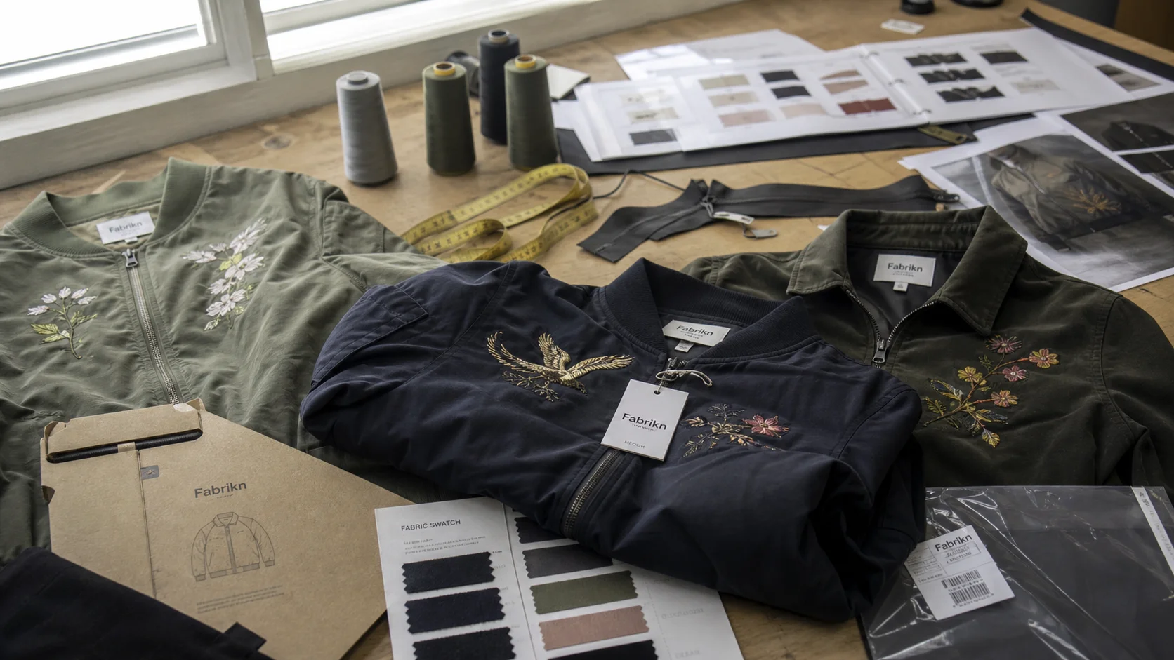
For apparel brands, that logic matters in private label clothing services too. A premium tee packed in a well-sized carton with a tissue wrap, a simple belly band, and a clean product card can outperform a heavier box stuffed with filler. The material choices should support the brand story, not shout over it. That is how to make packaging feel premium without wasting money on size alone.
Finishes leave a tactile memory. Matte coating lowers glare and often signals calm confidence. Soft-touch coating adds a velvety feel, but it must be used sparingly because it scuffs if the packing line is rough or if cartons rub in transit. Embossing and debossing make logos feel intentional without flooding the eye. Spot UV can work, but only when it highlights one element, not ten. Foil can look expensive at $0.06-$0.22 per unit, yet it can also look loud and dated if the artwork is overcrowded.
I prefer restrained gloss on product details rather than full-panel shine. A 15% gloss hit on a logo or edge can create contrast without turning the pack into a billboard. According to AATCC testing methods often used for color and finish consistency, repeatability matters more than novelty when a brand wants the same premium cue across 5,000 or 50,000 units. That is the quiet rule behind expensive-looking packaging: control the finish, control the message.
Sustainability still fits here. FSC-certified paperboard, soy or water-based inks, and mono-material construction can keep a pack premium if the design is disciplined. I’ve seen brands spend $2.40 on a layered box that looked busy, then switch to a $1.10 single-material carton with embossing and better typography. The second option felt more valuable and produced less waste. Not a compromise. Better editing.
Color is where many brands get loud when they should get precise. If you're refining how to make packaging feel premium, remember that premium packs usually use fewer colors, stronger contrast, and more whitespace. A dark ink on warm white board, or a single accent color on a neutral field, often reads richer than a rainbow of claims. I’ve seen brands with $0.22 packaging outperform rivals at triple the spend because their palette gave the eye room to breathe. Clutter makes a pack look promotional. Restraint makes it look considered.
Restrained does not mean empty. It means every element earns its place. European minimalism often uses off-white, black, sand, charcoal, or muted jewel tones, with one dominant logo and a sparse hierarchy. In parts of Asian beauty packaging, especially in Korea and Japan, there is often more delicacy, more shimmer, and more micro-detail, but the composition still feels organized. Decorative is fine. Chaotic is not.
Typography usually signals quality faster than illustration complexity. Serif type can suggest heritage and care on fragrance, wine, or premium apparel packaging. Sans-serif can look modern and clean on skincare, activewear, and DTC mailers. Letter spacing matters. Slightly increased tracking, around 20-60 units depending on the font, often improves readability and premium feel. A cramped wordmark on a sleeve can ruin an otherwise elegant pack.
I worked with one brand that cut artwork elements from 14 to 6 and changed the hierarchy so the product name was 35% larger than the claim stack. The result looked more expensive immediately. Same carton. Same 400 gsm board. Same 3-week production window. Only the type system changed. That is how visual discipline works. It saves money and improves perception at the same time.
For brands that need packaging to match apparel quality, cut and sew details, and fit consistency, the presentation should align with the product. That is where cut and sew manufacturing and packaging thinking meet. Customers notice when the box, insert, and garment label all speak the same language.
Cost tier sets the battlefield. A $0.30 pack cannot mimic luxury by force, and a $3.00 pack should not waste money on fake luxury if the product itself is modest. I break packaging into three spending bands: budget, mid-tier, and prestige. The trick is to spend where the hand notices first. Print quality, closure mechanism, and coating usually beat elaborate inserts on perceived value. Here is the practical split I’ve seen work across 200-plus factory visits.
At the low tier, spend on print clarity and structure. A badly cropped logo or a loose flap kills trust faster than plain board. At the mid tier, spend on coating and closure. At the prestige tier, spend on accuracy, not ornament. A $0.90 insert that keeps a bottle perfectly centered is worth more than a $1.80 foil pattern no one remembers.
Brands often overspend on secondary decoration. I’ve seen $0.40 added to a pack for a foil badge that tested worse than a $0.09 emboss. That kind of mistake happens when teams design from mood boards instead of sample tables. If you want premium perception per dollar, concentrate the money on the first touchpoint: the outer face, the opening motion, and the interior reveal.
For sourcing and budget planning, it helps to tie packaging to the broader production plan early. Last year I worked with a brand that saved 11% on total launch costs by aligning pack specs with production order timing and using one supplier for both assembly and fulfillment. If you need to request pricing fast, you can get a free quote and compare options before tooling begins.
Premium and responsible do not have to fight. The most convincing packs I’ve seen use FSC paperboard, mono-material formats, and water-based coatings that still photograph well under retail lighting. According to Textile Exchange, verified material choices matter because brands are judged on sourcing credibility as much as appearance. Packaging is no different. A box that looks expensive but feels wasteful can hurt trust faster than a plain one with honest materials.
Recycled fiber boards can look excellent, but the print limits are real. In several factories, I saw a 15-20% drop in color saturation on high-recycled-content board unless the ink formula was adjusted. Not a flaw. A production fact. Brands that know it choose darker palettes, stronger typography, and simpler artwork so the recycled texture looks intentional rather than faded.
Consumers are more skeptical of excess layers, plastic windows, and pointless void fill than they were five years ago. A box inside a sleeve inside a pouch inside another box reads as waste, not care. I’ve watched buyers in Germany and the Netherlands reject elaborate packaging because the product value did not justify the material pile. Premium should feel deliberate. It should not feel like a landfill with a logo.
One more reality: recycled content does not guarantee premium feel. Some high-recycled boards have weaker edge crush and less consistent caliper, which creates wrinkling in print and bad corners in assembly. The answer is not to abandon sustainability. It is to specify tighter tolerances, better coating, and fewer structural gimmicks. That discipline gives you a pack that photographs well, ships well, and keeps a cleaner story for the customer.
A beautiful spec sheet is not enough when you're deciding how to make packaging feel premium in real manufacturing. The difference between expensive and cheap often shows up at the die line. A 2 mm misalignment can throw off a logo, a flap, or a window enough to make the whole pack feel careless. I’ve rejected samples for a 1.5 mm drift on a magnetic closure because the eye reads unevenness instantly. Production discipline makes or breaks premium perception.
Common failures are predictable. Glue squeeze on the inner seam. Off-center logos. Scuffed soft-touch coating. Corner crush from overpacking cartons into master cases. Poor registration on a two-color print. These are not rare accidents. They happen when suppliers push speed over calibration. In China and Vietnam, I’ve seen excellent results from factories with tight QA systems and disastrous results from factories with better machines but weaker line supervision. Capability is regional, but control is local.
Ask for exact tolerances before you approve a sample. I want die-cut tolerance within ±1 mm, print registration within ±0.5 mm on critical marks, and consistent color within a defined delta-E range. If a supplier cannot talk clearly about those numbers, I treat that as a warning. Premium packaging depends on measurable control, not hopeful language.
When I visited a factory in South Korea, the team ran a 12-point sample checklist before sign-off. That level of discipline reduced rework by 28% and cut re-approval time from 10 days to 4. If your supplier cannot do that, they may still be fine for basic packs. They are not fine for premium cues. Your packaging design can be smart, but if production is sloppy, customers only see the flaw.
Start with a supplier call, not a mood board. If you're still figuring out how to make packaging feel premium, bring the product dimensions, the target unit cost, and the opening sequence you want the customer to feel. I tell brands to define three things before quoting: the outer touchpoint, the interior reveal, and the protected finish. That trims wasted samples fast. It also keeps the budget honest when suppliers begin adding extras you never asked for.
Then run fast tests. Put the pack on a shelf from two meters away. If it vanishes, simplify the copy or raise contrast. Do an unboxing test with one hand. If the opening motion feels awkward, fix the closure. Run a 5-second perception test with people who do not know the brand. Ask what the pack suggests about price, quality, and category. The answers will be blunt, which is useful.
The thing nobody tells you: the most premium-looking pack in the sample room can fail in a mailbox if the closure pops open, the corners crush, or the finish scratches after 20 feet of handling.
That is why I insist on costed alternates. Keep the strong design. Cut the decorative excess. Spend where the hand notices. If you are packaging apparel, tie the pack to garment quality, fit, and construction so the customer experiences one coherent promise. If the product is built with care, the package should earn that same trust in the hand, not just on the screen. That is how to make packaging feel premium without pretending it needs more than it does.
My final directive is simple: choose one premium cue, one structural cue, and one sustainability rule before you place the order. Then demand samples that prove all three. If the pack cannot survive the shelf test, the postage test, and the 5-second test, it is not premium yet. It is just expensive paper.
Use one strong material, one finish, and a clean hierarchy. A $0.30-$0.50 pack can feel premium with 350 gsm board, matte coating, crisp folds, and restrained typography. Spend on print registration and closure quality before you spend on foil or extra layers.
Typical ranges are $0.30-$0.60 for upgraded folding cartons, $0.80-$1.50 for better mailers or cartons with special finishes, and $2.50-$4.00 for rigid boxes with premium inserts. MOQ and lead time usually rise with each tier, from 1,500 units and 3-5 weeks to 500 units and 4-6 weeks.
Choose FSC paperboard, mono-material construction, and water-based or aqueous coatings. Avoid plastic windows, mixed laminates, and excess inserts. Recycled fiber can work well if you keep the palette simple and the structure precise.
Sampling usually takes 7-14 days, and full production often takes 3-6 weeks after approval. Complex rigid boxes can take longer if they require custom inserts, foil, or multiple proof rounds. Build in freight time separately.
Start with the garment story, then match the box or mailer to the product price and customer expectation. For apparel, a neat sleeve, tissue wrap, insert card, and precise sizing often matter more than heavy board. If you need a packaging and production partner, request mockups and compare board samples before tooling.