Private Label Apparel Logo Placement with checks for samples, fit, MOQ, QC evidence, pricing terms, and delivery risk.
Fast answer: Private Label Apparel Logo Placement: Text, Placement, Material, and MOQ should be judged by production evidence, not by a generic sourcing promise. The buyer needs sample proof, cost breakdowns, QC checkpoints, and delivery buffers in writing.
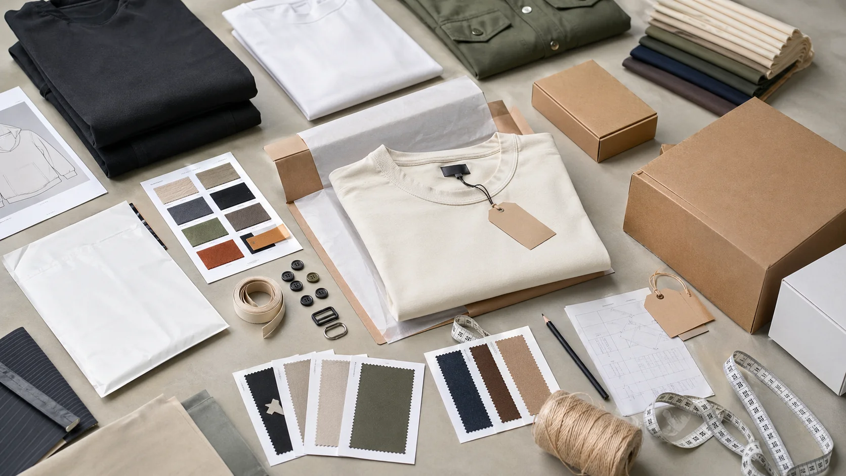
Ask for recent sample photos, measurement tolerances, fabric or print test assumptions, decoration test notes, packing examples, and a named inspection checkpoint. These details show whether the team can repeat an approved sample at bulk volume.
Separate garment cost, decoration, labels, packaging, sampling, testing, freight, and rush charges. When every cost line is visible, it becomes easier to reduce colorways, adjust size depth, or reserve more time for sampling.
Logo placement matters. It can lift a garment from plain to premium, make a brand easier to remember, and change the way people read the quality of the piece.
But get it wrong, and even a strong design can feel off, wear awkwardly, or miss the mark on visibility.
This private label apparel logo placement guide is meant to help brands, startups, and product teams make better branding decisions across t-shirts, hoodies, jackets, activewear, polos, headwear, and more. Whether you are launching something new or tightening up an existing line, the right placement can improve fit, sharpen the style, and keep the collection feeling consistent.
At Fabrikn, we work with brands to develop private label clothing that looks professional, feels right, and supports long-term growth.
If you are also exploring development support, visit our services page to learn more about how we help brands bring products to market.
Logo placement is not just a visual choice. It affects how the garment is worn, how the brand is perceived, and how customers interact with the product.
In private label apparel, the logo becomes part of the brand identity and often serves as a key differentiator in a crowded market.
A well-placed logo can:
Place it badly, though, and the whole garment can feel awkward. Too large, too high, too low, or shoved into an odd spot, and the balance is gone. Private label brands usually want consistency from one collection to the next, so logo placement should be handled early in product development instead of being tacked on at the end.
Before deciding where to place a logo, it is worth thinking past the obvious visual choice. The best spot depends on the garment, the customer, and how the product is meant to be used.
Your brand identity should drive the placement strategy. A fashion-forward label may lean toward understated placements like a hem tag, chest embroidery, or tonal print. A sportswear brand may want something more visible on the chest, sleeve, or back yoke.
Different garments come with different constraints. A hoodie gives you more room than a fitted tee. A polo has a collar and placket that affect the layout. A jacket may need the logo placed so it avoids seams, pockets, and zippers. The structure of the garment matters.
Your audience shapes how much branding they want. Some customers like bold, visible logos. Others want minimal, discreet branding. Knowing the buyer helps you decide whether the logo should stand out or stay quiet.
Embroidery, screen printing, heat transfer, woven labels, and silicone patches all behave differently on garments. Some methods work best on flat areas, while others suit smaller or curved spaces. Logo placement should match the decoration method chosen for production.
A logo should not get in the way of movement, comfort, or drape. A chest print that is too large can look distorted on smaller sizes, and a back neck label can irritate the wearer if the material is rough.
Fit still matters. A lot.
If your apparel is sold online, the logo should photograph well from multiple angles. If it is sold in retail stores, it needs to read clearly on hangers or folded displays. For promotional apparel, the logo may need to be larger and more direct.
There is no single “best” logo placement for every private label product. Still, some placements show up again and again because they balance visibility, versatility, and brand appeal.
The left chest is one of the most common logo placements in private label apparel. It is subtle, professional, and works well for polos, tees, jackets, and uniforms. This placement is a natural fit for embroidered logos, small screen prints, or patches.
Advantages:
Center chest placement is more visible and often used for streetwear, activewear, and casual fashion. It creates a strong focal point and works well for modern graphic branding.
Advantages:
Upper back placement, such as between the shoulder blades or below the collar, works well for secondary branding. It often shows up alongside a left chest logo or on garments where the front stays minimal.
Sleeve logo placement has a more contemporary feel and is often used for activewear, hoodies, and outerwear. It can be a good spot for small logos, text marks, or icon-based branding.
Lower hem placement is subtle and common in minimalist fashion. It gives the garment a premium finish without taking over the design.
Back neck logos are often used as a secondary branding element. This placement works well for woven labels, printed neck branding, or small embroidered marks.
For some product lines, especially premium or fashion-led collections, the logo may be placed on the waistband, inner label, or near the care label. It is a good option when the goal is quiet brand reinforcement rather than obvious visibility.
Every garment needs a slightly different approach. Here is how logo placement usually works across popular private label categories.
T-shirts are highly versatile, which makes them one of the easiest garments to brand. The most common placements are left chest, center chest, sleeve, and back neck. Oversized tees can handle larger center chest graphics, while fitted tees usually look better with smaller, more balanced marks.
Hoodies and sweatshirts offer solid branding opportunities, but pockets and hoods affect the layout. Common placements include left chest, center chest, sleeve, and upper back. If you are using embroidery, make sure the fleece is not so thick that it blurs fine details.
Polos usually call for a refined and professional logo placement. The left chest is the standard option, especially for corporate, golf, and hospitality apparel. Sleeve logos and subtle back neck branding can keep the look clean and premium.
Outerwear takes a little more planning because of zippers, seams, and pocket structures. Left chest, sleeve, upper back, and shoulder placements are popular. In many cases, smaller embroidered logos or patch applications work best for jackets.
Activewear brands often use logos in multiple locations, including the chest, sleeve, hip, waistband, and back. Since performance apparel is worn in motion, placement should avoid areas that stretch too much or feel irritating.
Caps and beanies usually feature logos on the front center, side, or back. Front placement offers the most visibility, while side or back placement creates a quieter branded look. Embroidery and patches are especially common for headwear.
For women’s apparel, logo placement often needs to follow the silhouette and styling details. A logo that works on a unisex tee may not suit a cropped top, fitted tank, or dress. Subtle placements like hem branding, cuff details, or back neck marks are often preferred for fashion-oriented collections.
The best private label apparel logo placement guide is one that balances three things: brand identity, garment fit, and logo visibility. Those three need to work together if the product is going to feel polished.
Your logo should reinforce the story you want customers to remember.
What does the brand feel like? Loud and graphic? Clean and minimal? Premium and understated? The placement should match that tone instead of fighting it.
Placement should respect the shape of the garment. A logo that sits perfectly on a size medium may look cramped on an extra small or too spread out on a 3XL. Testing across sizes is worth the time.
Sometimes the logo needs to be seen right away. Other times it should be there without shouting. That choice depends on the product and the customer. A good placement gives you the right level of presence without overpowering the garment.
Logo placement is not only a design decision. It also has real production consequences. A placement that looks good in a mockup may need adjustments once it hits actual fabric.
Seams, pockets, zippers, and plackets can all affect where a logo can go. A placement that crosses a seam may not print cleanly or embroider evenly.
Knits, fleece, woven fabrics, and performance blends all react differently to decoration. Stretch fabrics may distort prints, while textured surfaces can affect embroidery clarity.
Logo size often needs to change across garment sizes. What looks right on a medium may need to be scaled for smaller or larger sizes so it stays proportionate.
Some placement zones are easier for manufacturers to repeat consistently than others. If your production run needs tight control, choose a location that is simple to measure and reproduce.
A few mistakes show up again and again in private label apparel.
And one more: skipping samples. A placement can look great on paper and still feel wrong on the finished garment. Testing beats guessing every time.
The easiest way to avoid logo placement problems is to bring your manufacturer into the conversation early.
Share your brand goals, target audience, decoration method, and any references you like. Ask for sample placements, strike-offs, or mockups before moving into full production. A good manufacturer will help you refine the logo size, position, and method so the finished piece feels intentional.
At Fabrikn, that back-and-forth is part of the process. We help brands think through placement choices before production starts, so the final product looks and wears the way it should.
If you need support with private label development, our services team can help you move from concept to production with less friction.
A strong brief makes the supplier's job narrower and the quote more reliable. For private label apparel logo placement, include the target customer, sales channel, expected order quantity, size range, decoration needs, packaging requirements, and delivery market. Then call out the details most likely to affect the result, especially material grade, print tolerance, and barcode size.
The brief should also explain what cannot change. Some brands care most about hand feel, some about price, some about launch timing, and some about retail compliance. When those priorities are not written down, suppliers tend to optimize for whatever is easiest to quote. Clear priorities help the factory make better tradeoffs before the first sample is cut or printed.
Ask the supplier to respond with assumptions, not just a price. A useful reply states MOQ, sample route, production capacity, inspection plan, packing method, and freight handoff. If the answer is vague, the project may still work, but it needs a tighter pre-production stage before money and calendar pressure build up.
The best time to catch problems is before the pre-production sample is approved. Check measurements, color, placement, material behavior, shrinkage, construction, labels, and packaging in the same review instead of approving each item in isolation. Many bulk issues are not caused by one dramatic mistake; they come from several small unchecked assumptions.
For private label apparel logo placement, pay special attention to folding method, pack-out sequence, and retail compliance. These details often look minor in an email but become expensive once cutting, printing, sewing, packing, or shipping begins. A simple checklist with owner, due date, and approval status keeps the brand team and factory aligned.
Bulk production should not start until the supplier can explain how the approved sample becomes a repeatable production standard. That means reference sample storage, line instructions, inline checks, final inspection, and defect handling. A factory that can describe this process clearly is usually safer than one that only promises speed.
Price differences are useful only when the quotes cover the same work. Compare sample cost, material source, trims, decoration, packaging, testing, inspection, and freight assumptions. A low unit price can become expensive if it excludes items the brand needs before launch.
Timeline promises deserve the same scrutiny. Ask what happens if the first sample needs revision, whether materials are in stock, when the production slot is reserved, and how export packing is handled. The most reliable supplier is often the one that gives a realistic calendar instead of the fastest optimistic answer.
What is the most common logo placement for private label apparel? Left chest placement is one of the most common options because it is clean, versatile, and works across many garment types.
Should the logo placement be the same across all products? Not always. A consistent branding approach helps, but the placement should still fit the garment type, fabric, and audience.
Which logo placement looks most premium? That depends on the brand, but subtle placements like left chest, hem, or back neck often feel more premium than oversized front graphics.
Can logo placement affect comfort? Yes. A poorly placed logo can interfere with seams, stretch zones, or sensitive areas of the garment.
Should I test logo placement before production? Absolutely. Samples and mockups are the best way to check fit, visibility, and overall balance before placing a full order.