A production-focused checklist for school operations teams to verify sleeve print maps, catch placement errors early, and reduce reprints across uniform orders.
Sleeve Print Map QC Checklist for School Teams - Decoration & Printing manufacturing guide
A sleeve print map quality control checklist for school operations teams gives structure to a part of production that is easy to underestimate. Sleeve graphics look simple on the approval sheet, yet they are among the easiest decoration points to misplace, distort, or size inconsistently across youth, women’s, and adult garments. A school team managing uniforms, spirit wear, club apparel, or event merchandise needs a repeatable process that catches those errors before they reach distribution.
This checklist is written for purchasing, athletics, activities, and operations staff who need practical control over decorated apparel. The goal is not to turn school staff into print technicians. The goal is to make the order clear enough that a vendor can produce the right sleeve print, on the right garment, with the right placement, at the right size, and with enough documentation to catch issues early.
A sleeve print map is the placement guide that shows exactly where a design sits on the left or right sleeve, how far it is from seams and cuffs, and whether the artwork is oriented vertically, horizontally, or at an angle. On school apparel, sleeve graphics often carry sponsor logos, department identifiers, team marks, mottos, or event branding. The placement has to stay consistent across sizes, because a logo that looks balanced on a youth medium can look crowded or too low on an adult 2XL.
The sleeve is one of the most inspection-sensitive areas on a garment. It curves, narrows, and changes shape after sewing and finishing. A print that is technically centered on the flat pattern can still look off once the garment is assembled. That is why a sleeve print map quality control checklist matters. It gives the school team and the vendor a shared reference before production starts.
For schools, the issue is not only aesthetics. Sleeve placement can affect readability, sponsor recognition, compliance with team branding rules, and the perceived quality of the order. A well-controlled sleeve print usually signals a well-managed order. A sloppy one tends to expose every other weakness in the process.
If your team is sourcing decorated apparel through a larger program, it helps to align the print map with broader purchasing standards and supplier communication practices. Resources such as Fabrikn services can be useful as a reference point when comparing what a supplier can handle versus what the school needs documented in writing.
Most sleeve print problems start before production. The artwork may be approved in concept, but the production instructions are incomplete. School teams should force clarity in six areas before any sample is cut or printed.
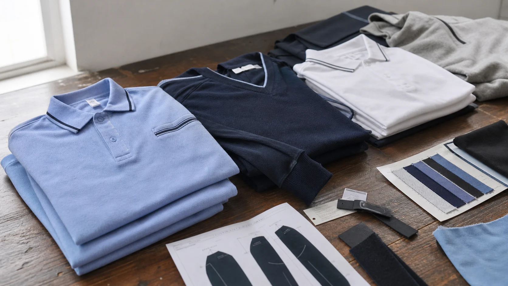
The sleeve print map depends on the garment body. A polyester performance tee behaves differently from cotton, fleece, jersey knit, or a blended hoodie. Fabric content affects print method, ink holdout, cure behavior, and the risk of dye migration. Trim details matter too. Rib cuffs, dropped shoulders, and seam panels can shift the usable print window on the sleeve.
Screen print, heat transfer, direct-to-film, sublimation, and embroidery all require different placement tolerances. A map that works for a screen print may not be appropriate for a heat-applied graphic if the sleeve taper is aggressive. The school team should confirm the decoration method in advance, because the print window, edge clearance, and acceptable movement differ by method.
The map must specify whether the design reads from the top of the sleeve down, from cuff to shoulder, or outward from the shoulder seam. Without orientation notes, different production teams may interpret the same artwork in different ways. That creates avoidable rework, especially on repeat orders.
A strong sleeve print map shows whether the design size remains fixed across all garments or scales by size run. School apparel often needs separate instructions for youth, women’s, and adult bodies. The logo may need a narrower width on small youth shirts and a slightly larger footprint on adult sizes to preserve visual balance.
Color should be tied to a reference standard, whether that is a Pantone callout, a previously approved sample, or a vendor-specific color library. The school team should know how much variation is acceptable. On sleeve graphics, small color shifts are visible because the eye reads the sleeve as a secondary focal point. If the sleeve print carries school colors, the acceptable range should be tighter.
School orders often stall because no one knows who has final signoff. The approval chain should name one responsible person for art proof approval, one person for garment and size confirmation, and one person for shipment release. When a sleeve print map is involved, that chain should also include a visual placement approval, not just an art file approval.
The checklist below is built for practical use. It is not a design guide. It is a control list that helps school operations teams prevent avoidable errors.
Checkpoint What to verify Common risk Suggested acceptance standard Placement reference Distance from shoulder seam, cuff, and side seam Graphic sits too low or too close to seam Use a written measurement and a visual mockup Orientation Artwork direction on left and right sleeves Graphics printed mirrored or facing the wrong way State orientation on the map and proof Size run Youth, women’s, and adult scaling rules Same size used across all garments without adjustment Approve a size chart or fixed master size with notes Garment compatibility Sleeve width, seam shape, cuff type, fabric stretch Design collides with seams or distorts on wear Confirm the decoration window on actual garment spec Artwork integrity Logo proportions, fonts, line weight, edge sharpness Thin details disappear or blur in production Approve production-ready vector art Color control Pantone or approved reference sample Unexpected shade variation across runs Require a documented color reference Method match Print method suits fabric and quantity Adhesion failure, cracking, or poor opacity Match decoration method to material and order size Wash durability Expected performance after laundering Peeling, fading, or shrink-related distortion Request method-specific durability confirmation Left/right consistency Same placement logic across both sleeves One sleeve sits higher, lower, or rotated differently Use a master map for each sleeve side Final carton sample Finished goods match approved sample Bulk production drifts from approval Inspect first cartons before releaseThe first control point is placement. Sleeve print maps should show the exact starting point from the top of the shoulder, the centerline reference, and the distance to the cuff edge. If a logo is intended to sit 1.5 inches below the shoulder seam, that instruction should appear on the map, not only in an email thread. The map should also note whether the measurement is taken on a flat garment or on-body after wear, since those are not identical in practice.
School teams should ask for a mockup showing the sleeve from both front and back views if the artwork wraps or if the sleeve has seam interruptions. A flat placement note alone is not enough when the sleeve shape changes through the armhole and elbow area.
Before production, the vendor should confirm that the artwork is in a production-ready format. Vector files are usually preferable for print graphics because they preserve edge quality and scale cleanly. Files that depend on embedded low-resolution images create risk on close-view sleeve placements, where any softness is obvious. Thin outlines, small text, and delicate registration marks are all vulnerable. A school team should expect the vendor to flag those issues before cutting screens or generating transfers.
Size grading is a frequent source of confusion. A school may assume that one approved placement works for all sizes. In practice, the same measurement can look very different on a youth small and an adult 3XL. The sleeve circumference, seam angles, and visual balance change as size changes. The best practice is to define either a size-scaled chart or a fixed placement range with clear exceptions for small and extended sizes.
The sleeve print map should be reviewed alongside garment specs. Lightweight performance knits, brushed fleece, ring-spun cotton, and poly-cotton blends do not behave the same way during heat application or washing. Ribbed cuffs, contrast sleeve panels, and insert seams can also interfere with placement. A school team that orders the same design across multiple garment bodies should not assume one map applies to all of them.
Every approved sleeve print map should have a date, version number, and signoff note. This is especially important when the same art is reused for different seasons or grade levels. If the vendor issues a revised proof after a correction, the earlier version should be marked obsolete. The team should never rely on a memory-based approval process.
A sleeve print map is not just a visual reference. It is the record that tells production where the design belongs, how large it should be, and what counts as acceptable variation.
Sample approval is where school teams save money. The sampling step may feel slow, but it is usually cheaper than correcting a bulk run. For sleeve graphics, the sample should be evaluated on the actual garment style, not only on paper or on a generic shirt image. A proper approval workflow should include a placement sample, a color sample if color precision matters, and a size check on the smallest and largest garments in the run when possible.
Typical approval steps are straightforward:
Schools often ask how many samples are necessary. The answer depends on order size, complexity, and risk tolerance. For simple one-color sleeve logos on a stable cotton tee, one pre-production sample may be enough. For mixed fabric orders, sponsor-heavy designs, or orders with youth and adult grading, a second approval step is often justified. The extra round is easier to defend than a remake.
Sleeve printing carries a few recurring risks that should be written into the quality control plan. The first is misplacement. Even a small shift in measurement becomes visible because the sleeve has a narrow viewing field. The second is distortion, especially on curved or tapered sleeves where the print may stretch or compress during wear. The third is adhesion failure, often linked to incompatible inks, insufficient curing, or fabric finishes that resist bonding.
Inspection should be built around the points most likely to fail. A school team does not need to inspect every stitch in a decorated order, but sleeve graphics deserve focused attention. A practical inspection pass should look for:
Bulk inspection should happen before distribution, not after cartons are sent to buildings, teams, or families. Once orders are split across departments, replacement costs rise and accountability gets harder. A school team that receives final goods should keep one sealed carton or sample piece for comparison in case a customer complaint comes back later.
School operations teams should plan around realistic minimum order quantities and lead time dependencies. The exact numbers vary by vendor and decoration method, but common patterns are easy to outline. Screen-printed sleeves may favor larger runs because setup costs are spread across more units. Heat-applied or digitally produced sleeve graphics can support smaller runs, though per-unit cost may be higher.
Typical MOQs in this category often fall into these broad ranges:
Lead time depends on four main variables: blank garment availability, art approval speed, decoration method, and inspection workload. A clean order with pre-approved art and in-stock garments may move quickly. An order that needs special fabric sourcing, custom color matching, or multiple rounds of sample approval will move more slowly. School teams should treat promised delivery dates as dependent on approval speed as much as on factory capacity.
The tradeoff is simple. Faster production usually reduces flexibility. Lower MOQs often increase unit cost. Greater placement precision can extend lead time because the vendor needs more proofing and inspection. The right choice depends on whether the school is buying for a one-time event, a recurring athletic program, or a multi-season uniform plan.
If a school needs help comparing capabilities before placing an order, the vendor’s public information can be a useful starting point. Pages such as about Fabrikn and contact Fabrikn are the sort of references buyers use to understand how a supplier communicates, what services are available, and how quickly the team responds to order questions.
Schools get better results when they ask specific questions. Broad questions invite broad answers. A sleeve print project needs tighter language.
These questions do more than protect the school’s budget. They also expose whether the supplier has a disciplined decoration process. A vendor that can answer placement, grading, and inspection questions clearly is usually easier to work with than one that relies on vague assurances.
The best sleeve print map QC checklist is not the longest one. It is the one that changes buying behavior. School teams should use the checklist to decide where to spend effort and where to simplify. A complex design with small text, multiple colors, and sleeve wrapping may look strong in a presentation, but it often carries more risk than value. A simpler sleeve mark may be a better tradeoff if the program needs repeatability, cost control, and short lead times.
For recurring school programs, standardization is usually the right move. Choose a limited set of approved garment bodies, confirm one or two decoration methods, and keep sleeve print maps on file by season. That reduces re-approval cycles and makes reorders easier to manage. For one-off event apparel, the standard should be even stricter, because there is no second chance once the event passes.
Purchasing teams should also resist the habit of approving artwork before confirming decoration constraints. The right sequence is garment first, method second, placement third, art fourth. Reversing that order creates painful compromises later, especially on sleeves where the usable area is narrow and the visual tolerance is low.
When a supplier offers multiple production options, the school should compare not just price, but risk. A lower quote can hide a weaker approval process, smaller inspection window, or tighter assumptions around artwork quality. Those hidden costs usually appear later as delays, replacements, or complaints from coaches, parents, or staff.
If the team needs a short working version of the checklist, these are the non-negotiables:
Schools that follow those steps usually avoid the most expensive sleeve-print mistakes. The process is not complicated. The discipline is what matters.
Get a free quote from Fabrikn — your trusted B2B clothing manufacturer with 10+ years of experience. MOQ as low as 200 pieces.
Get a Free Quote →A sleeve print map is the placement guide that shows where a design should sit on a garment sleeve. It normally includes measurements from seams and cuffs, orientation notes, size instructions, and references for the approved artwork.
Sleeves are curved, narrow, and size-sensitive. A print can look correct on a flat proof and still sit too low, too high, or slightly rotated on the finished garment. A separate checklist helps catch those issues before bulk production.
Many school apparel orders start around 24 to 48 pieces for simple decorated items, while screen print programs often lean toward 50 to 100 pieces or more. The actual MOQ depends on the print method, garment type, and whether sizes and colors are split across the order.
One pre-production sample may be enough for a simple one-color sleeve print on a stable garment. Mixed fabrics, graded size runs, sponsor-driven designs, or tighter color expectations often justify an additional sample or a more detailed approval round.
Misplacement, wrong orientation, weak artwork details, color drift, poor adhesion, and garment incompatibility are the usual causes. Size grading errors also show up often when the same placement is used across youth and adult garments without adjustment.
Keep the approved sleeve map, artwork version, garment spec, and color reference on file. Standardize the blank styles where possible and require a documented sample approval before every bulk run if the order is recurring or high visibility.