A production-focused review of how sleeve print maps behave across size grading for gym programs, including placement drift, artwork scaling, fit changes,...
Category: Decoration & Printing
For gym program buyers, sleeve print map size grading is not a design detail to leave until the end. It affects decoration cost, artwork readability, production speed, and reject risk. A sleeve graphic that looks balanced on a size M can drift out of position on XS or 3XL if the print map is not graded with the garment. That problem shows up fast in activewear, where stretch, seam placement, and frequent washing make weak artwork decisions more visible.
This review is written for sourcing teams, merchandisers, and product developers who need practical guidance before sampling and bulk order placement. The main question is not whether sleeve prints can be made. They can. The real question is whether the print map is sized and graded in a way that fits the full size range, the fabric, and the decoration method without inflating cost or creating avoidable quality issues.
If you are coordinating with a garment supplier or decoration partner, start early with a clear map pack and size chart. Review the artwork against the fit block, confirm the print placement on every size, and lock down the decoration method before production begins. If you need support from a sourcing team, see our services, about us, or contact us.
Sleeve Print Map Size Grading Review for Gym Buyers - Decoration & Printing manufacturing guide
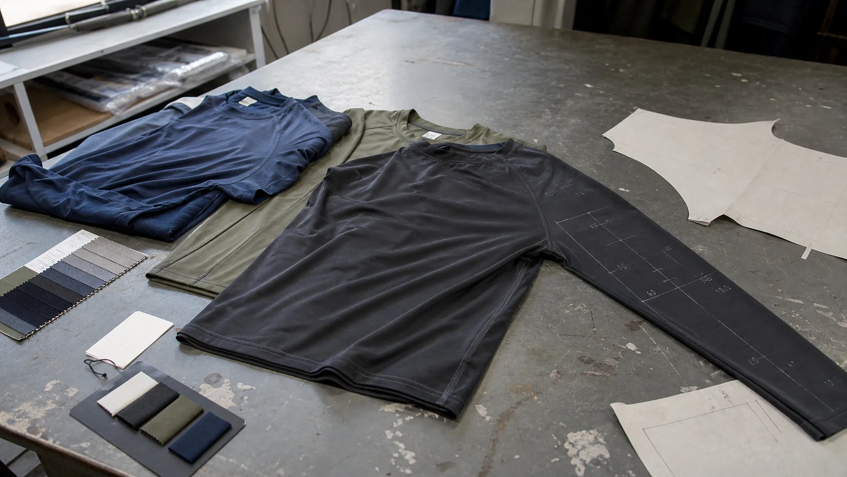
Sleeve print map size grading is the process of scaling or repositioning the sleeve artwork across the garment size curve so the print remains visually balanced and technically printable. The map is the artwork placement reference. The grading is the rule set for how that placement changes from one size to the next.
In a gym tee, long sleeve, raglan, or compression top, the sleeve is rarely a flat visual surface. The shape changes through the bicep, elbow, forearm, and shoulder cap. That means the same print file can produce different results depending on how the pattern is graded. A map that is too rigid can sit too close to a seam on smaller sizes and look overly low on larger sizes. A map that is scaled too aggressively can distort logo readability or move text into a curved area where it breaks visually.
For gym buyers, the safest view is simple: the print map is part of the product specification, not a decorative afterthought.
Gym assortments usually sell across a broad fit range. That makes grading more important than in a narrow-size fashion capsule. A men’s training line may run from XS to 3XL. A women’s activewear line may include cropped fits, relaxed fits, and compression fits in the same story. Sleeve print placement has to survive that range.
Three commercial issues show up most often.
For premium programs, buyers usually want the artwork to feel intentional on every size. For value programs, the focus is often on keeping print setup simple enough to maintain cost discipline. Both approaches are valid. The tradeoff should be explicit before sampling starts.
A good sleeve print map begins with the garment body, not the art file. The first check is where the sleeve panel sits on the pattern and how it changes in the graded set. That includes armhole depth, sleeve length, sleeve opening, and the relationship between the shoulder point and the print start point.
Practical placement questions should be answered before artwork finalization:
Most buyers do better when they request a size-by-size placement chart. That chart should show the print width, print height, distance from shoulder point, distance from sleeve hem, and any notes about rotation or seam avoidance. For complicated graphics, a flat sketch alone is not enough. A map overlaid on each size pattern is a stronger control tool.
There is no universal formula, but many suppliers use a controlled scaling approach rather than a pure proportional blow-up. In practice, small sizes may need a slightly reduced print width so the artwork does not wrap too far around the arm. Larger sizes may need a modest increase in width, but not a full geometric scale, because the visual impact on the body is already larger due to the garment size itself.
That is the core judgment call: scale the print enough to preserve balance, but not so much that you distort the brand asset or push the design into unsafe zones on the sleeve.
Size grading for sleeve prints should be tied to the pattern grading, not done as an isolated graphic exercise. The garment dimensions drive where the print can sit, and the print itself may need separate rules for width, height, and position. A single percentage scale often causes trouble because sleeve proportions do not change in a perfectly linear way.
Useful grading rules usually include the following:
Buyers should also pay attention to artwork line thickness and text size. Thin lines often fail first in heat transfer, sublimation on textured surfaces, or ink printing on stretch fabric. Tiny text becomes unreadable once the sleeve curves around the arm. A design that looks clean in Adobe Illustrator may not survive physical garment curvature without adjustment.
For programs with many sizes, a practical approach is to define three anchor sizes rather than reworking every size independently. A small, middle, and large sample can establish the placement rule. The remaining sizes follow from that approved map. This reduces revision cycles and keeps the supplier focused on repeatable production logic.
The print method determines how much freedom you have in sleeve mapping. A buyer who ignores this will end up with artwork that is technically approved in CAD but difficult to execute in bulk.
Decoration Method Strengths Common Limits Buyer Watch-Out Screen print Cost-effective on larger runs, strong color opacity Setup cost, fewer color changes, less suited to complex gradients Check ink hand-feel and stretch cracking on fitted sleeves Heat transfer Good for detail, smaller runs, variable names/numbers Transfer edge lift, wash durability varies by film quality Test adhesion on stretch zones and curved sleeve surfaces Sublimation Good for polyester, lightweight feel, full coverage capability Needs polyester-rich fabric, color may shift on different bases Confirm fabric composition and avoid seams that interrupt the image Embroidery patch or appliqué Premium look, durable on stable zones Less comfortable on high-flex areas, can add weight Avoid bulky placement near elbow flex pointsThe best choice depends on the garment fabric, price target, and order volume. Screen print is often efficient for larger gym programs, but it needs careful ink selection if the sleeve is highly stretchable. Heat transfer can handle sharper detail, though it usually requires more material control and a stricter wash test. Sublimation performs best on polyester-based products and is usually not the right route for cotton-rich gym tees.
When the buyer is comparing options, the decision should be based on total risk, not just decoration price. A lower-cost print that fails wash performance or looks misaligned across sizes is not a saving.
Sleeve print grading cannot be separated from fabric and garment construction. A 100% cotton jersey, a cotton-elastane blend, and a polyester performance knit behave differently under print pressure and heat curing. The same artwork may pass on one base and fail on another.
Common fabric considerations include:
Construction also matters. Raglan sleeves, dropped shoulders, and contoured athletic fits all change the visual path of a sleeve graphic. A print placed on a standard set-in sleeve may look centered in the flat but shift when worn. Pattern shape should be checked in motion, not just in a flat lay.
Trim and finishing choices can create secondary risks. Cuffs, binding, sleeve hems, and overlock seams may interfere with placement. Garment washing can also affect the final appearance if the print is placed too near a seam that puckers after laundering. That is why buyers should ask for a physical pre-production sample, not only a digital mockup.
A basic spec package should cover print size in centimeters or inches, placement tolerance, garment size range, fabric composition, and finish requirements. If the artwork includes fine text or a logo lockup, define the minimum line thickness and smallest text height the factory can safely reproduce. Without that, small revisions creep in later and are harder to control.
Sampling is where most sleeve print issues are found, which is exactly why it should not be rushed. A disciplined approval process saves time later.
The approval point should be explicit. Some buyers approve only the print artwork and forget to approve placement on each size. That creates late-stage disputes when the factory scales the artwork in a way that is technically consistent but visually off. Other buyers approve a sample without checking wash performance, then discover cracking or edge lift after production is already underway.
Best practice is to request the print standard in writing. That standard should say what counts as acceptable for color variance, location tolerance, edge sharpness, and distortion across the size set. If the supplier cannot define that clearly, expect more variance in bulk.
MOQ is one of the first commercial filters in sleeve print programs. Typical MOQ ranges depend on decoration type, fabric, and complexity. For custom sleeve print gymwear, a common range is 300 to 1,000 pieces per colorway or print setup. Smaller quantities are possible, especially for heat transfers or highly digital processes, but unit cost usually rises.
Lead time depends on more than printing. It is affected by fabric availability, trim sourcing, sample approval speed, print method, and production queue. A simple sleeve logo on stocked fabric may move quickly. A multi-size program on custom-dyed fabric with special finishing can extend the timeline by several weeks.
Buyers should ask the supplier to separate the lead time into stages:
That breakdown gives a more honest view than a single promised ship date. It also makes dependencies visible. If a supplier is waiting on fabric approval, the print map cannot be fully locked. If the print requires a special transfer film, that should be ordered early. Buyers who track only the final delivery date often miss the bottleneck that actually controls the schedule.
Inspection should check both garment quality and print consistency. Sleeve graphics fail in ways that are easy to overlook if the inspection standard is too general.
Common risks include:
Inspection risk is higher on dark synthetic fabrics, stretch knits, and small graphics with fine details. One practical control is to inspect the first production bundle by size, not just by style. That helps catch a problem that only shows up on one end of the size range. Another useful check is to review samples after wash and stretch, since sleeve movement can expose weaknesses that a flat inspection misses.
Buyers should treat sleeve print approval as a three-part decision: visual balance, production repeatability, and wash durability. A graphic that wins only on the first point is not ready for bulk.
Before releasing a sleeve print gym program to bulk, a buyer should confirm the following:
A clean handoff from product development to production matters more than most teams expect. If the buyer leaves a print map open to interpretation, the factory will make a practical decision based on speed and machine constraints. That may be perfectly efficient for the supplier and wrong for the brand. Tight specifications reduce that gap.
For buyers comparing suppliers, a strong sourcing partner should be able to explain why a sleeve print map is being graded in a particular way, not just say it has been “adjusted for size.” That level of clarity is one marker of a mature decoration program. If you need a supplier conversation to turn into a usable production spec, start at contact us.
For most gym programs, the most reliable approach is a controlled print map with modest grading, clear no-print margins, and one approved visual standard for the size range. That keeps the artwork recognizable while respecting the limits of stretch fabric and bulk production.
In lower-price programs, buyers often need to simplify the sleeve graphic to protect lead time and yield. That usually means fewer colors, larger type, thicker line work, and placement away from the highest-stretch areas. In premium programs, the buyer can invest in better print fidelity, but the specification must still be tight. Premium does not mean vague. It means the process can support a more refined result, provided the sample path is disciplined.
The safest commercial principle is to choose a decoration method that matches the product’s performance promise. A training tee with repeated wash cycles should not rely on a fragile decoration just because it looks good on day one. A sleeve graphic that matters to the brand deserves the same level of technical attention as fit and fabric.
Get a free quote from Fabrikn — your trusted B2B clothing manufacturer with 10+ years of experience. MOQ as low as 200 pieces.
Get a Free Quote →It keeps the sleeve artwork visually balanced and technically safe as garment sizes change. The goal is to avoid misplacement, distortion, and production inconsistency across the size curve.
Not always. Many programs use anchor sizes and controlled scaling rules. The right method depends on the garment block, the artwork complexity, and how strict the brand wants placement to be.
A common range is 300 to 1,000 pieces per colorway or setup, though the actual MOQ depends on the print method, fabric, and supplier capability. Smaller runs are possible, but the unit cost usually rises.
There is no single safest method. Screen print, heat transfer, and sublimation each have different strengths. The correct choice depends on fabric content, stretch level, wash requirements, and the complexity of the artwork.
At minimum, buyers should review artwork proof, placement proof, a physical sample on the actual fabric, a fit sample, and a pre-production sample. Wash and stretch testing are important for performance apparel.
Misplacement, size drift, seam interference, cracking, peeling, and color inconsistency are the main risks. These issues are more likely when the print map is not tied closely to the graded pattern and fabric behavior.
It can be, but that is not always the best choice. Smaller sizes may need tighter placement control, while larger sizes often need a revised visual balance. The decision should be based on garment proportion and the brand standard.
For buyers who want a disciplined sourcing process, the real value is in early spec control. A sleeve print map that is properly graded, tested, and approved reduces rework and protects delivery. That is the practical standard worth using on any gym program.