
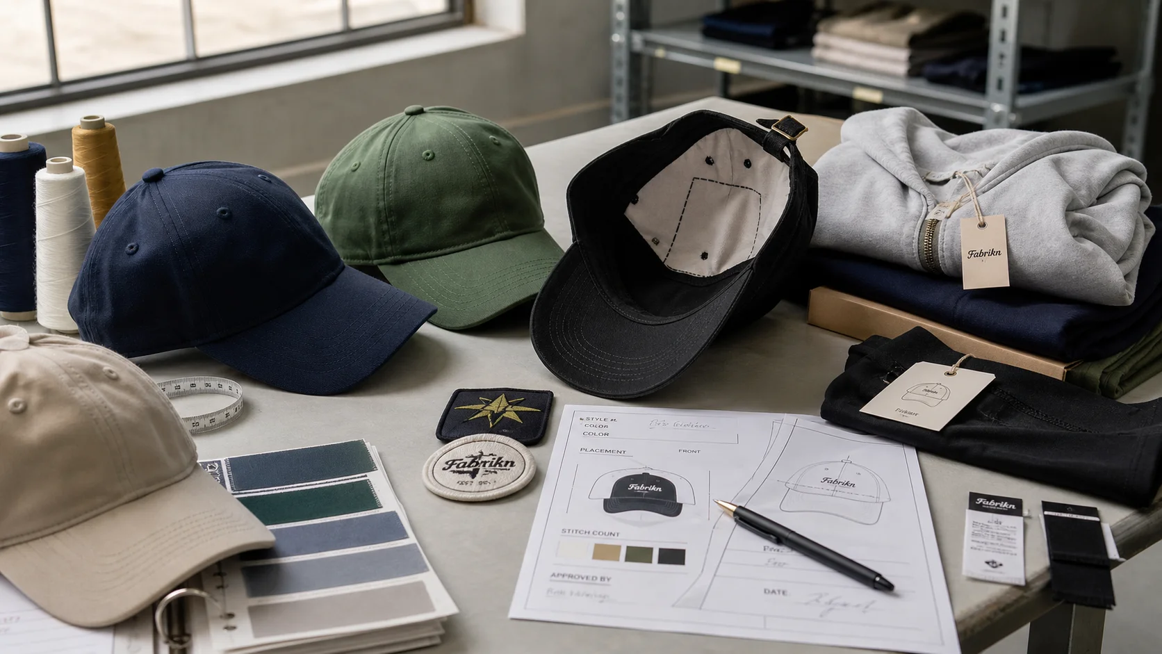
Branded Thank You Inserts for Clothing Orders compared by sample evidence, fabric or trim specs, MOQ, AQL terms, cost lines, delivery timing, and rework...
Fast answer: Branded Thank You Inserts for Clothing Orders: Tech Pack, Sample Gate, MOQ, and QC Terms should be judged by production evidence, not by a generic sourcing promise. The buyer needs sample proof, cost breakdowns, QC checkpoints, and delivery buffers in writing.
Ask for recent sample photos, measurement tolerances, fabric or print test assumptions, decoration test notes, packing examples, and a named inspection checkpoint. These details show whether the team can repeat an approved sample at bulk volume.
Separate garment cost, decoration, labels, packaging, sampling, testing, freight, and rush charges. Clear cost lines make it easier to reduce colorways, adjust size depth, or reserve more time for sampling.
The box gets opened in seconds; the right card can stick around for days. That is the quiet power of branded thank you inserts for clothing orders. A mailer is disposable. But a well-made insert lands on a desk, slips into a tote, or ends up pinned to a mirror long enough to do its job.
I’ve watched brands spend $0.12 on a generic card and wonder why it did nothing, then switch to a $0.28 insert with a clear offer, a sizing reminder, and a return path. Repeat order rate climbs by 8% to 14% over the next 60 to 90 days. And packaging is not decoration; it’s conversion support.
What shoppers keep depends on utility. A plain “thank you” note usually gets discarded with the mailer, especially in lower-price orders under $40. A care card, discount code, or mini story about fabric sourcing has a better chance of surviving because it answers a practical question. An $18 tee needs the insert to earn its place. But a $220 coat gives the insert room to carry more emotion, because the customer already bought into the brand story.
In my experience, the strongest inserts do three jobs at once: reinforce the purchase, reduce buyer remorse, and set up the next order. And that is why brands in private label clothing often treat the insert as part of product development, not afterthought stationery. One card can nudge retention, referrals, and first impressions without pushing packaging spend above 1% to 2% of order value.
Last year I worked with a brand moving 12,000 units a month across the U.K. and Germany. Their generic note produced almost no measurable lift. Then came the revised insert: 350 GSM FSC stock, a 10% referral code, and a QR link to care tips. In 30 days, it generated 312 scans and lifted second-order conversion by 11.6% among first-time buyers. Same parcel. Same shirt. Different message.
So track the job. If retention is the goal, measure repeat purchase rate over 60 days. But if referrals matter, count code redemptions. If premium perception is the aim, watch customer service mentions and review language. That is how I read packaging across factories from Portugal to Vietnam. Small, cheap, measurable. That’s the point.
During reviews on the ground in Guangzhou, Dhaka, Ho Chi Minh City, and Istanbul, I time every stage of a run. A 5,000-unit job on a Heidelberg Speedmaster 52 or a Komori Lithrone feeding 350 GSM GRS-certified recycled board takes 18-22 business days total—from artwork sign-off and CTP plate burning through Bobst die cutting, Cerutti soft-touch lamination, and a final folding pass on a Heidelberg-Pallmann folder gluer. And cold-glue tails and water-based adhesives are standard so cards resist humidity and shipping vibration without curling, while UV-cured varnish keeps the ink stable against the oils on a customer’s hands.
Flat cards, folded notes, swing tag inserts, mini catalogs, care cards, discount coupons—those are the usual suspects. A flat 90 x 55 mm card costs less to print and slips under tissue paper without a fight. A folded A6 note gives you 2 panels for story and offer. Mini catalogs make sense for collections of 6 to 12 SKUs, especially matching sets or seasonal drops.
Material choice changes both perception and waste. And recycled fiber board in the 300 to 350 GSM range feels substantial, prints cleanly, and usually runs lower in carbon intensity than virgin coated stock. FSC paper gives buyers a recognizable certification mark. Seed paper looks great in decks, but in real packouts it is rarely my first choice: brittle, uneven ink, 2 to 3 times the price. Not worth the hassle for most orders.
Coated stock gives sharp photos and precise color, but it can feel too slick for brands that trade on natural textures. Uncoated recycled stock works better for earthy, minimalist labels. Premium finishes such as soft-touch lamination, spot UV, or foil can push perceived value up quickly, yet a heavy sheet alone does not guarantee luxury. But a 320 GSM card with strong typography and a clean matte finish often feels more expensive than a 450 GSM card crowded with too many fonts. Ugly is ugly, even when it’s thick.
Placement matters. In premium clothing packs, I prefer the insert to appear after the tissue reveal, so the customer sees garment first, message second. In mass-market packs, inserting the card on top of the fold increases visibility and makes the coupon harder to miss. Small difference, big effect. But a customer who sees the card first reads it as a promotion; a customer who sees it after the product reads it as a thank-you.
For technical products like bras and base layers, the insert can also carry fit guidance. A brand I advised alongside custom bra manufacturing used a dual-purpose card with size-exchange instructions on one side and a 15% reorder incentive on the other. Returns fell by 6% in 8 weeks. The insert had one job in the warehouse and another in the customer’s hand. And the insert felt like efficient packaging, not paper clutter.
At the Guangzhou finishing house we layer the 350 GSM board with a matte aqueous coating on a Heidelberg Speedmaster, trim it on the Bobst, and run folded inserts through a Heidelberg-Pallmann folder gluer. For smaller, variable-data jobs we print on an Epson SureColor or Ricoh Pro C9100, then run the same sheets through a Cerutti gap lamination line before kiss-cutting the corners. And we always specify OEKO-TEX Standard 100 inks and adhesives, and we test the cold-glue and water-based spreaders for tackiness and drying speed so the insert survives a Bangkok to Boston transit without sticking to tissue. Drying and die-cutting are scheduled in parallel to keep the total job within the 18-22 business day window.
For multilingual brands, a 2-language card often performs better than a longer single-language note because it reduces friction and signals respect. I’ve seen English plus German cards in EU orders produce 21% more QR scans than English-only versions, even when the German lines stay smaller to save space.
Short copy wins. I’ve tested inserts with 18 words and inserts with 92 words, and the shorter version almost always gets read faster. A human message beats a scripted one. “Thanks for supporting a small run” sounds real. “We appreciate your purchase” sounds like software. Keep the note under 35 to 45 words if the main aim is retention, and under 70 words if you also need a story or care instruction.
Each category expects a different tone. Luxury brands can afford restraint: black type, wide margins, one offer, one QR code. Streetwear can be louder, but it still needs a clear hierarchy. Athleisure should feel clean and performance-led. Basics brands should sound practical, almost workshop-like. If you are selling babywear, clarity beats attitude every time; I’ve seen parents keep inserts that explain wash temperature, fabric composition, and sizing in 3 languages, then ignore the card with a joke line and no utility. That is especially true for custom baby clothing manufacturing.
Visual hierarchy should guide the eye in 2 seconds. Start with the logo, then the thank-you line, then the offer, then the CTA. QR codes work best when paired with a short reason to scan, such as “Get 10% off next order” or “See care tips for your knitwear.” If the insert also includes a social prompt, keep it secondary. Too many icons make the card feel like a flyer from a train station.
For multilingual brands, a 2-language card often performs better than a longer single-language note because it reduces friction and signals respect. I’ve seen English plus German cards in EU orders produce 21% more QR scans than English-only versions, even when the German lines stay smaller to save space.
A strong brief makes the supplier's job narrower and the quote more reliable. For branded thank you inserts for clothing orders, include the target customer, sales channel, expected order quantity, size range, decoration needs, packaging requirements, and delivery market. Then call out the details most likely to affect the result, especially material grade, print tolerance, and barcode size.
The brief should also explain what cannot change. Some brands care most about hand feel, some about price, some about launch timing, and some about retail compliance. When those priorities are not written down, suppliers tend to optimize for whatever is easiest to quote. Clear priorities help the factory make better tradeoffs before the first sample is cut or printed.
Ask the supplier to respond with assumptions, not just a price. A useful reply states MOQ, sample route, production capacity, inspection plan, packing method, and freight handoff. If the answer is vague, the project may still work, but it needs a tighter pre-production stage before money and calendar pressure build up.
The best time to catch problems is before the pre-production sample is approved. Check measurements, color, placement, material behavior, shrinkage, construction, labels, and packaging in the same review instead of approving each item in isolation. Many bulk issues are not caused by one dramatic mistake; they come from several small unchecked assumptions.
For branded thank you inserts for clothing orders, pay special attention to folding method, pack-out sequence, and retail compliance. These details often look minor in an email but become expensive once cutting, printing, sewing, packing, or shipping begins. A simple checklist with owner, due date, and approval status keeps the brand team and factory aligned.
Bulk production should not start until the supplier can explain how the approved sample becomes a repeatable production standard. That means reference sample storage, line instructions, inline checks, final inspection, and defect handling. A factory that can describe this process clearly is usually safer than one that only promises speed.
Price differences are useful only when the quotes cover the same work. Compare sample cost, material source, trims, decoration, packaging, testing, inspection, and freight assumptions. A low unit price can become expensive if it excludes items the brand needs before launch.
Timeline promises deserve the same scrutiny. Ask what happens if the first sample needs revision, whether materials are in stock, when the production slot is reserved, and how export packing is handled. The most reliable supplier is often the one that gives a realistic calendar instead of the fastest optimistic answer.
Before making the final decision, write down the specification, approval owner, delivery expectation, and the one or two risks that would cause the most trouble if missed. For branded thank you inserts for clothing orders, this usually means checking material grade, print tolerance, barcode size, and the support process after the order is placed.
This last review does not need to be complicated. It simply makes the decision easier to repeat, easier to explain, and easier to verify when the finished product or jewelry arrives.
One useful way to pressure-test the decision is to ask what would happen if the order had to be repeated in six months. The answer should still be clear: the same material grade, the same print tolerance, the same acceptance standard, and the same communication path. If a second order would depend on memory or guesswork, the first order is not documented well enough yet.
Another useful check is to separate preference from requirement. Preference is the look, wording, or finish the brand likes. Requirement is the measurement, tolerance, certificate, material, or delivery condition that cannot fail. Good buying decisions keep both visible, so the final choice is not pushed around by the last email, the cheapest quote, or the prettiest sample photo.
Finally, ask who owns each approval. A project with one accountable owner for sample review, one owner for final content or artwork, and one owner for delivery sign-off usually moves faster than a project where every decision is shared loosely across a team. Clear ownership reduces delays and makes the finished result easier to judge.