
Design Luxury Swing Tags for Clothing Brands compared by sample evidence, fabric or trim specs, MOQ, AQL terms, cost lines, delivery timing, and rework...
Fast answer: Design Luxury Swing Tags for Clothing Brands: Tech Pack, Sample Gate, MOQ, and QC Terms should be judged by production evidence, not by a generic sourcing promise. The buyer needs sample proof, cost breakdowns, QC checkpoints, and delivery buffers in writing.
Ask for recent sample photos, measurement tolerances, fabric or print test assumptions, decoration test notes, packing examples, and a named inspection checkpoint. These details show whether the team can repeat an approved sample at bulk volume.
Separate garment cost, decoration, labels, packaging, sampling, testing, freight, and rush charges. Clear cost lines make it easier to reduce colorways, adjust size depth, or reserve more time for sampling.
Three seconds, maybe five. That’s all most shoppers give a garment before their brain files it under premium, ordinary, or not worth the ask. In that blink, a swing tag can outweigh the seam finishing, the lining, even the fabric hand feel. If you’re wondering how to design luxury swing tags for clothing brands, start there: the tag is often the first proof of value. I’ve seen it in London, Milan, and a dozen factory showrooms in between. A disciplined tag can make a $78 knit read like $128. A messy one drags a $240 coat down a rung.
How to design luxury swing tags for clothing brands is not a side question. It sits at the center of the price conversation. Price signal. Craft signal. Discipline signal. Buyers read all three before they ever pinch the cloth. Premium DTC usually sits in the 120 to 350 GSM range, with soft-touch varnish and crisp die-cuts. High street still leans on 250 GSM and plain offset print. True luxury goes heavier: 400 to 600 GSM, letterpress, foil, edge control so exact it looks machine-made in the best way.
At retail, the tag does a strange little dance. Notice me, then vanish. Say enough to support the ticket price, but not so much that it reads like a sales sheet. I watched buyers in Portugal reject a beautiful jacket because the tag looked cheap under fluorescent lighting. Not upscale. Cheap. Brutal, but useful.
According to ISO standards on legibility and print consistency, contrast, spacing, and reproducibility are functional, not decorative. A brand selling at $45, $120, or $480 needs the tag to match the promise. And social media turns that tag into a tiny billboard. Mirror selfies. Unboxing clips. Boutique flat lays. A polished tag gets photographed; a flimsy one gets cropped out or ignored because it looks off.
The most expensive-looking tags I’ve handled were often the simplest: superb cardstock, clean finishing, zero fuss. Then there were the overworked ones. Five effects on one tag. Busy, desperate, trying too hard. A Milan label once showed me a tag with one deep emboss, thick uncoated stock, and a cotton string. Less money to produce. Far more expensive-looking.
Regional habits show up fast. Italian suppliers lean tactile and restrained. Turkish mills are strong on board consistency and can turn samples in 7 to 12 days. Vietnam often delivers sharp bulk pricing, around $0.08 to $0.18 per piece on larger runs, but the real value is prepress discipline. The tag is small; buyers treat it like evidence. When you work with a manufacturer or factory, that attention to production quality matters as much as the design itself.
Begin with the tag as a compressed brand statement, not a mini brochure. Modern minimalism wants calm, spare, exact. Heritage tailoring can borrow crest marks, serif typography, blind embossing. Fashion-editorial labels can lean into asymmetry, crop marks, a more experimental grid. Consistency is the point. Before anyone reads a word, the tag should already feel like it belongs on the garment.
I use a blunt little checklist with clients: one core message, one visual anchor, one proof point. That keeps copy from ballooning into 40 or 60 words, which is too much for a tag that may only measure 55 x 90 mm or 60 x 100 mm. A premium knit might need one phrase on the front and the fabric origin on the back. A tailored coat can carry the collection name up front, then the atelier story and fiber content behind it. This is where a good supplier can guide custom options without pushing unnecessary extras.
Typography carries a lot. Sans serif, tight tracking, centered layout — that can feel contemporary at $65 to $180. High-contrast serif type suggests heritage and control, especially on 320 GSM uncoated stock. Color matters too. Black on warm white feels expensive because it is legible and measured. Deep green, tobacco, oxblood often read richer than pure jewel tones, which can tip into costume if the finish is wrong.
I’ve seen brand DNA handled beautifully through shape alone. Square tags feel architectural. Rounded corners soften the label for knitwear or babywear; that approach works well in custom baby clothing manufacturing, where calm cues matter. For athletic or bodywear pieces — a sculpted bra line, say — a narrow vertical tag can feel sleeker and less fussy, which is why it often pairs well with custom bra manufacturing. If you’re comparing wholesale and bulk production options, the same visual rules still apply.
Luxury copy is edited copy. Twelve to 18 words can feel refined. Thirty-five words starts sounding nervous. Want storytelling? Put it on the back panel or a folded insert. Want origin claims? Make them measurable: “Italian-milled wool,” “100% organic cotton,” “Made in Portugal.” No padded adjectives. I’ve watched brands bury confidence under soft, timid phrasing. Usually that means they don’t trust the product to carry its own weight.
For labels built around private label clothing, the swing tag still needs a voice. Ownable, not generic. I like one sentence of positioning and one hard fact. That keeps the tag aligned with the garment’s price, whether the item sells at $48 or $280. It also helps people remember the brand later, when they see the item again online and recognition starts doing the work. In other words, how to design luxury swing tags for clothing brands is partly about restraint.
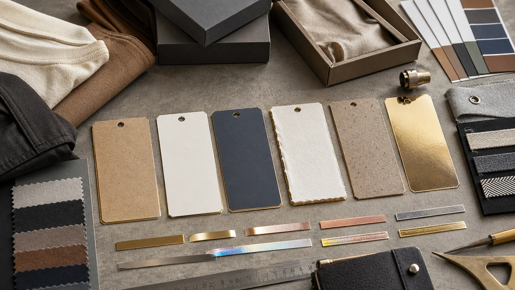
Touch decides belief. Heavy uncoated stock usually feels more premium than glossy laminated tags in refined categories because it absorbs light and softens the hand. A 400 GSM cotton paper can feel tactile and expensive without a single metallic flourish. Glossy laminate may look louder on a supplier board; in store, especially under warm light, it often feels weaker. For brands selling at $150 and up, that subtlety matters more than sparkle.
In factories, I judge tags the same way I judge garments: by how they behave after handling. Good tags survive 10 to 15 touches without fraying. Poor ones curl after one humid day. If the collection includes structured pieces made through cut and sew manufacturing, the tag has to meet that level of construction. Buyers spot the mismatch immediately. Meticulous jacket, flimsy tag? That’s not a bargain. It’s a crack in the story.
Board weight matters, just not by itself. Premium ranges usually land between 300 and 600 GSM. Uncoated stocks print beautifully when the brand wants a matte, editorial tone. Recycled stocks can be just as strong, though recycled fiber content changes the hand feel. Some 100% recycled boards feel soft and artisanal. Others feel a bit rough. That roughness can be a virtue when the brand leans natural and modern.
According to Textile Exchange, brands face growing pressure to document material claims with precision. Swing tags are part of that pressure. If recycled board is on the brief, ask for recycled-content proof, FSC or equivalent chain-of-custody documents, and ink specs. A brand can’t claim sustainability and then use a tag with no traceability. Retailers and marketplaces are checking more often. So are customers.
Each finish says something different. Foil brings ceremony and contrast. Embossing feels tactile and restrained. Debossing suggests depth and control, especially on thick stock. Spot UV can separate elements visually, though too much of it starts looking promotional. Edge paint, when it’s clean, is one of the sharpest luxury cues because it frames the object and makes the board look engineered.
My factory visits taught a blunt rule: one premium effect usually beats three fighting for attention. A black tag with blind emboss and matte lamination can look richer than a tag loaded with foil, spot UV, metallic string, and a shaped punch. Complexity can read as indecision. The best luxury swing tags are edited. They know when to stop.
Sustainability brings trade-offs. Vegetable-based inks are better, but the coating can complicate recycling. Compostable strings may be cotton or paper twist, and yes, they often look better than plastic — but they can add $0.02 to $0.06 per unit. If recycled fiber is part of the brief, ask whether the finish stack still allows common municipal recycling. Beautiful is not enough. It has to hold up under scrutiny. That’s especially true when you’re designing custom tags in China or anywhere else with a broad factory network.
The cleanest upgrade is often subtraction: one stock, one print method, one finish. In my experience, simplifying the construction improves both perceived luxury and production consistency.
Structure decides whether the tag feels calm or cluttered. I usually start with front, back, and, if needed, a folded insert. Front: logo or collection mark, product name, maybe one line of positioning. Back: fiber content, country of origin, SKU or barcode, short brand note. Folded? Put care guidance or authenticity messaging inside. A buyer should be able to scan the hierarchy in 2 seconds, not read a paragraph.
On premium hang tags, size and price should not fight for attention. In boutique settings, size can live on a removable sticker or secondary label. Price belongs with the retailer, not always on the brand tag, unless the store requires it. For e-commerce, the front has to photograph cleanly at 2000 to 3000 pixels wide and still read. Strong contrast. Wide margins. No tiny type jammed at the edge. That’s the practical part of how to design luxury swing tags for clothing brands that actually sell.
Logo first. Collection name second. Product name third. That order works. I rarely go beyond 2 or 3 fonts. More than that and the tag starts behaving like a catalog page. If the brand uses a crest, monogram, or symbol, give it room. Don’t crowd it with text. Subtle brands can go almost empty on the front, and that emptiness is often the point. Luxury doesn’t need to shout.
Category matters too. Tailoring can carry more formality. Casual jersey pieces need lighter treatment. A boxy tee at $58 should not wear the same language as a $680 coat. The mismatch jumps out. I’ve seen brands rescue product perception with nothing more than a better front layout, and I’ve seen them sink it with a loud block of five lines they thought looked “premium.” It didn’t.
Back copy protects trust and cuts down customer service noise. Put fiber composition in plain language, care instructions people can actually follow, and the country of origin. Wholesale? Barcode and SKU are usually non-negotiable. If the fabric has a special story, keep it short: “Italian-milled wool, woven in Biella” is stronger than a paragraph. Offering care support or authentication through QR code? Fine. Just make sure the page loads in under 3 seconds and works on mobile.
Do not bury compliance behind design. Retailers and customs teams still want fiber content and origin statements. Government and trade data from trade.gov make the point clearly: documentation matters more as brands cross borders and move into wholesale. A tag that looks elegant but omits required details can delay a launch by 2 to 6 weeks. That’s not luxury. That’s avoidable friction.
Pricing moves faster than founders expect. A simple premium tag might land at $0.06 to $0.18 per piece for 5,000 units. A multi-finish luxury tag usually sits between $0.22 and $0.70, depending on board, foil, emboss, edge paint, and stringing. Short runs of 250 to 500 units often cost 2 to 4 times more per tag because setup costs barely shrink. That’s where smaller brands overspec the brief and pay for features they cannot amortize.
I’ve seen brands spend $1,200 on tags for a 300-piece drop and then underinvest in product photography. Bad trade. If the collection retails at $38 to $75, a restrained tag with excellent print quality usually does the job. If the line sits at $180 to $450, a more considered finish stack is easier to justify. Match the margin structure, not the mood board.
Simple tags use one stock, one print method, one cut shape. Premium standard tags add foil, embossing, or a specialty string. High-finishing tags may layer edge paint, deboss, soft-touch coating, and a die-cut window. Every addition brings cost and risk. A custom shape can add $80 to $300 in tooling. Hot foil may add $0.05 to $0.20 per unit. Edge painting can add $0.04 to $0.12 per unit, depending on the line.
For brands still figuring out their position, I recommend testing three levels: entry premium, core premium, and signature luxury. Cleaner supplier comparisons. Fewer dead-end arguments in the design room. A launch brand with MOQ 1,000 should not buy a 6-effect tag if a 1-effect version already reads expensive. When you brief a factory in bulk, the clearer the structure, the better the production outcome.
Domestic suppliers can often sample in 5 to 10 days and produce in 2 to 3 weeks. Overseas suppliers may need 7 to 14 days for samples, 3 to 5 weeks for production, plus another 1 to 4 weeks for shipping. Air freight closes the gap and blows up the cost. Sea freight saves money and makes timing shakier. If your launch date is fixed, build in a 2-week buffer for corrections. Tags fail in small ways: cropped foil, misaligned punch holes, a black that prints charcoal instead of black.
MOQ shapes the economics. Some factories quote 500 pieces; others want 1,000, 3,000, or 5,000. At lower quantities, per-unit cost jumps because plate setup, die cutting, and finishing labor get spread across fewer tags. Brands launching private collections should compare cost per impression, not just cost per unit. A tag that costs $0.30 but lifts perceived value by $12 beats a $0.08 tag that weakens the brand.
Sustainable tags do not need to look medicinal. Recycled paper can still feel refined if the board is chosen carefully, the ink density is controlled, and the design is edited. I’ve handled recycled stocks from 250 GSM to 420 GSM that printed beautifully, though the texture ranged from smooth to visibly flecked. FSC-certified board is an easy baseline. Cotton-based papers feel more luxurious, but they can cost 15% to 35% more than standard uncoated stock. Hemp and bagasse can work too, though not every factory handles them well.
Be specific with claims. Ask for recycled-content percentage, chain of custody, and ink chemistry. I prefer vegetable-based inks when the supplier can show consistent curing, but vague “eco” language goes straight in the bin without paperwork. If the tag includes a coating, ask whether it changes recyclability. Some soft-touch laminations look beautiful and create disposal problems later. Poor trade, if the brand is serious about waste reduction. A good supplier will give straight answers about production, quality, and compliance.
The strongest recycled tags usually rely on texture, not decoration, to signal value. A 350 GSM recycled board with blind emboss can feel more premium than a glossy virgin-fiber tag. Smaller formats help too. A 50 x 80 mm tag uses less fiber, less ink, less trimming waste than a 70 x 120 mm tag. Fewer material combinations also make end-of-life sorting simpler. That matters when volume climbs and room for error shrinks.
There’s a clean link between construction discipline and waste. In factory visits, the best sustainability wins came from simplifying the spec, not just switching paper. One well-planned tag with a single string hole and no laminate is easier to source, easier to recycle, and easier to keep consistent across 3,000 or 30,000 units. Sustainability starts at the spec sheet. Not the slogan.
Ask for low-VOC or vegetable-based inks, FSC documentation, and proof of origin from the paper mill. If the supplier can’t provide batch-level traceability, the claim is weak. I also ask for trim-loss estimates. A custom shape may waste 8% to 15% more board than a clean rectangle. If the shape adds little brand value, that waste is hard to defend. Sustainable design means measuring the whole chain, not just the final look.
Standards like those listed by OEKO-TEX push brands to think more rigorously about chemical inputs and material safety, even for non-garment components. Useful pressure. It keeps the tag aligned with the clothing, which matters when the product is sold as responsible, traceable, and durable. For brands sourcing from a supplier or manufacturer in China, the same checks apply.
Before you request quotes, build a one-page tag brief. Dimensions. Board weight. Finish. Print colors. String material. Hole position. Quantity. Target price. Delivery deadline. Add whether the tag is for retail, wholesale, or e-commerce presentation. If barcodes or multilingual copy are needed, say so upfront. Leave out a detail and you can add 3 to 5 days to the proof cycle and burn a revision round. No reason for that.
Ask for three price tiers. Clean and economical. Target luxury. Maximum spec. Side by side, they expose where the money goes. If the supplier can show samples in the same paper family with different finish stacks, even better. That makes the foil-versus-emboss-versus-edge-paint decision much easier. It also helps when you compare manufacturers and factories across regions.
Your brief should answer six questions: what size, what stock, what finish, what information, what quantity, what deadline. Brand references only if they help. Two or three visual benchmarks are enough; twelve screenshots are noise. If your team already handles cut and sew manufacturing, keep the tag brief just as disciplined as the tech pack. Good suppliers move faster when the brief is short and exact.
When samples arrive, check them in daylight and warm indoor light. Touch the edges. Look for fiber lift, scuffing, ink rub. Measure the cut. Compare color against the proof, not memory. If the sample uses a special effect, ask for a second strike to confirm consistency across 50 to 100 pieces. I also suggest a PDF proof plus a hard-copy sample before sign-off. Fewer reprints. Better launch timing.
For a faster decision, ask suppliers to quote three versions at once: low, medium, and high finish. Compare unit cost, lead time, perceived value. The best tag is not always the most elaborate. It is the one that makes the garment feel worth its price the moment a buyer lifts it from the rack. That’s how to design luxury swing tags for clothing brands without wasting budget.
Start with one clear brand message, one strong visual anchor, and one proof point. Use 300 to 600 GSM stock, restrained typography, and a finish that matches the garment’s price tier. The tag should be readable in 2 seconds and look consistent with the collection.
For 5,000 units, simple premium tags often run $0.06 to $0.18 each. Multi-finish luxury tags usually land between $0.22 and $0.70 each, depending on stock, foil, embossing, edge paint, and stringing. Short runs of 250 to 500 pieces cost more per unit.
Domestic production often takes 2 to 3 weeks after approval, with sampling in 5 to 10 days. Overseas production can take 3 to 5 weeks plus shipping time, and samples may take 7 to 14 days. Build in at least 2 extra weeks for revisions and freight delays.
Include size, board weight, finish, print colors, string type, hole position, quantity, deadline, and required legal copy. Add barcode needs, origin statements, and whether the tag is for retail or wholesale. A one-page brief cuts quote errors and speeds up sampling.
Yes. Recycled FSC-certified board, cotton-based paper, vegetable-based inks, and simple finishes can look refined. In many cases, a single emboss or blind deboss on 350 GSM recycled stock looks richer than multiple flashy effects. The key is clean construction and verified sourcing.