A practical SEO outline for restaurant apparel buyers who need a contrast bartack map compliance checklist to standardize reinforced stitch placement, brand color use, safety expectations, and production approvals across multi-unit uniform programs.
Contrast Bartack Map Checklist for Restaurant Buyers - Decoration & Printing manufacturing guide
Category: Decoration & Printing
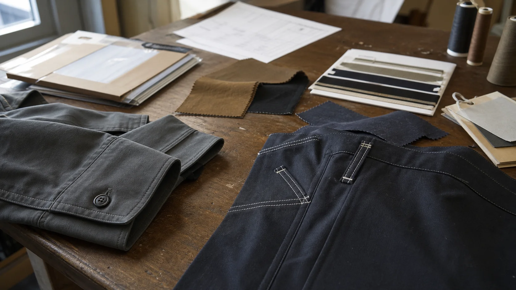
Contrast bartacks look like a small detail, but they can create outsized problems in restaurant uniform programs. A bartack is a dense reinforcement stitch used at stress points such as pocket corners, apron tie ends, vent openings, placket bases, belt loops, and side-slit seams. When that bartack is made in a contrasting thread color, it becomes both a functional reinforcement and a visible brand detail.
For restaurant buyers, the issue is not whether contrast bartacks are attractive. The issue is whether every location, garment size, production batch, and replenishment order receives the same bartack placement, color, stitch density, and orientation. A chef apron with red bartacks on the pocket corners may look intentional. A later batch with red bartacks on the pocket corners and waist-tie ends may look inconsistent. A server shirt with black bartacks near a printed logo can look sharp, but only if the bartacks do not distort the print area or create visible thread tension around the decoration.
Restaurant groups also face a harder wear cycle than many retail apparel buyers. Uniforms are washed frequently, exposed to heat, rubbed against counters, pulled at waist ties, and used across many body types and shift patterns. Bartacks are often placed exactly where the garment takes the most stress. If the contrast thread is poorly specified, the garment can pass a quick visual check but fail after repeated laundering.
Purchasing judgment: contrast bartacks are worth specifying when they support brand identity or make reinforcement points look intentional. They are not worth adding casually if the supplier cannot control placement, thread shade, and replenishment consistency.
A clear contrast bartack map compliance checklist gives buyers a way to control this detail before production. It also helps manufacturers quote accurately, sample correctly, and inspect consistently. In larger restaurant programs, this checklist should sit beside the tech pack, artwork file, fabric standard, trim card, and approved pre-production sample.
A bartack map is a placement document showing every required bartack on a garment. It should identify the bartack location, thread color, size, stitch density, direction, seam relationship, and whether the bartack is visible or hidden. For contrast bartacks, the map must be more precise because the stitch is part of the visible decoration system.
Restaurant buyers often use contrast bartacks across aprons, chef coats, utility shirts, overshirts, work pants, caps, and service vests. The bartack map may be a garment sketch, flat technical drawing, annotated photo, or production worksheet. The best version combines a front and back technical flat with numbered bartack points and a specification table.
A vague note such as “contrast bartacks at stress points” is not enough. Factories may interpret stress points differently. One sewing line may apply bartacks to pocket corners only. Another may add them to side slits, tie ends, label tabs, pen pockets, and hanger loops. If the order is split across multiple lines or repeated six months later, variation becomes likely.
The map should be treated as a controlled production document, not a loose visual reference. If the restaurant group has several brands under one corporate buyer, each brand may need its own bartack standard. A premium dining concept may require tonal bartacks or discreet reinforcement. A fast-casual brand may use bright contrast bartacks as a recognizable uniform feature.
The following checklist is designed for restaurant groups sourcing uniforms at scale. It can be used before requesting a quote, during sample review, and again before bulk production approval.
Checklist Area Buyer Requirement Why It Matters Common Risk Placement map Every contrast bartack is numbered on the garment flat Prevents supplier interpretation Extra or missing bartacks across batches Thread color Color reference is tied to an approved physical thread card Controls shade under kitchen and dining-room lighting Thread appears too bright, dull, or mismatched Stitch density Stitch count or density range is stated Protects reinforcement performance Bartacks look bulky or weak Size tolerance Length and width tolerances are defined Keeps visible detailing consistent Uneven bartacks on pocket corners Decoration clearance Minimum distance from prints, embroidery, patches, and labels is specified Avoids decoration distortion Bartack overlaps artwork or puckers print area Laundry durability Thread, fabric, and contrast shade are wash-tested together Restaurant uniforms face frequent laundering Color bleed, shrinkage distortion, or thread fray Bulk inspection AQL and critical placement points are defined Gives QC a practical pass/fail standard Inspection checks only general appearanceStart with the business reason. Are the bartacks part of the brand look, a durability feature, a way to tie the uniform to logo colors, or a visual cue across multiple garment categories? Buyers should not add contrast bartacks just because they appear inexpensive. They require color control, sewing control, and inspection control.
If the contrast bartack is brand-facing, include it in the decoration and printing conversation. It should be considered alongside embroidery thread, screen print ink, heat-transfer color, woven label yarn, snap color, zipper tape, and button finish. A red bartack that is close but not close enough to the logo red can make the entire uniform look less controlled.
Each bartack location should receive a number. For example, BT-01 and BT-02 may be upper apron pocket corners, BT-03 and BT-04 may be lower pocket corners, and BT-05 and BT-06 may be waist-tie end reinforcements. Numbering avoids ambiguous comments such as “add at pocket edges.”
Use the same numbering across sample comments, production files, QC reports, and supplier communication. If BT-04 is crooked on the sample, the buyer and factory can discuss the same location without confusion.
Thread should be specified by fiber, ticket size, color reference, and approved supplier reference when possible. Polyester thread is common for restaurant uniforms because it generally offers good strength and wash resistance. Cotton thread may be selected for a specific hand feel or vintage look, but it can behave differently under repeated industrial laundering.
For most commercial uniform programs, a practical specification may state “100% polyester sewing thread, contrast color matched to approved thread card, shade tolerance within approved bulk standard.” Buyers should avoid relying only on digital color references. Screen colors do not translate reliably to thread on fabric.
Bartack size should fit the garment and fabric weight. A heavy canvas apron can carry a larger bartack than a lightweight poplin shirt. A typical visible bartack may fall around 8 mm to 14 mm in length, but the correct size depends on the stress point, seam allowance, fabric thickness, and brand look. The checklist should define both target and tolerance.
A practical tolerance might allow small variation, such as target length 10 mm with a tolerance of plus or minus 1 mm. Tolerances that are too tight can increase cost and rejection rates. Tolerances that are too loose can make the garment look inconsistent at store level.
Contrast bartacks may use contrast thread on the face side and matching thread on the bobbin side, or contrast thread on both sides. This decision matters for reversible aprons, rolled sleeves, side slits, and garments where the inner side may be visible during work.
If the buyer wants clean interior finishing, the map should state whether bobbin thread must match the body fabric or match the contrast top thread. Factories may default to a practical production setup unless instructed otherwise.
Restaurant uniform categories need different bartack logic. Buyers should not copy the same map across aprons, chef coats, shirts, and pants without considering how each garment is worn.
Aprons are the most common category for contrast bartacks. Common points include pocket corners, pen pocket dividers, towel-loop ends, neck-strap attachments, waist-tie entry points, tie ends, side tabs, and split openings. A bib apron may need reinforcement at the upper corner where the neck strap joins the body. A waist apron may need careful control at the pocket corners because they sit directly in the customer’s line of sight.
For restaurant groups, apron bartacks must balance durability with appearance. Too many contrast bartacks can make the apron look busy. Too few can leave obvious stress points under-reinforced. The strongest buying choice is to use contrast bartacks only where they either reinforce a genuine stress point or support the brand design.
Chef coats may use bartacks at sleeve vents, side vents, pocket openings, placket bases, and sometimes underarm or side-seam stress points. Contrast bartacks on chef coats are more sensitive because the garment already has buttons, piping, embroidery, or printed branding. Buyers should confirm whether contrast bartacks compete with other decoration elements.
White chef coats require special caution. A dark contrast bartack can look sharp on a sample but may show thread shadowing, dye transfer, or lint collection after laundering. If the restaurant group uses centralized laundry services, wash testing should include the real temperature and detergent conditions where possible.
For woven shirts, contrast bartacks may appear at chest pocket corners, sleeve placket ends, side-seam vents, yoke tabs, and hem slits. The risk is visual imbalance. A contrast bartack at a chest pocket corner near an embroidered logo can draw attention away from the logo or make the pocket look misaligned if the stitching is not square.
Buyers should request a worn-fit sample or at least evaluate the garment on a form. Flat inspection can miss how bartacks sit when the shirt is buttoned, tucked, or layered with an apron.
Restaurant work pants, chef pants, and utility bottoms use bartacks at pocket openings, belt loops, fly bases, side pockets, cargo pockets, and vented hems. Contrast bartacks on pants are less common in formal restaurant settings but may work well for casual, industrial, or streetwear-influenced uniforms.
Durability should lead the decision here. If contrast bartacks are placed at belt loops or pocket openings, they need enough stitch strength to survive repeated pulling. Poorly balanced thread tension can cause broken stitches or puckering, especially on stretch fabrics.
A compliant contrast bartack map should link the visual detail to measurable production specifications. Restaurant buyers do not need to become sewing engineers, but they do need enough information to prevent vague production.
Specification Typical Buyer Direction Tradeoff Thread fiber Polyester is common for wash durability May look slightly shinier than cotton Thread size Match to fabric weight and bartack visibility Thicker thread gives stronger visual contrast but can bulk up Color reference Use approved physical thread card and bulk shade standard Extra approval step but better consistency Stitch density Define target range by garment and fabric High density improves coverage but can cut delicate fabric Bartack length Common visible range may be 8 mm to 14 mm Longer bartacks look more prominent Tension Balanced thread, no loops, no skipped stitches Requires line setup and in-line QC disciplineColor is often the hardest part to control. A thread that matches the logo on a trim card may look different when stitched into black denim, white twill, or gray canvas. Contrast depends on the ground fabric. Buyers should approve the actual thread stitched into the actual production fabric, not just the thread cone.
Restaurants with multiple concepts should also think about color hierarchy. A corporate group may use one shade of orange for a casual concept and a darker rust for a premium concept. If both orders run through the same supplier, the tech packs need clear thread references. The factory should not be left to interpret “brand orange.”
Contrast bartacks sit inside the broader decoration and printing system. They may be small, but they can affect how logos, labels, patches, transfers, and printed graphics are perceived. Buyers working with a manufacturing partner should align bartack maps with the decoration placement sheet.
If a logo is embroidered above an apron pocket, bartacks at the pocket corners should not pull the pocket out of square. If a heat transfer sits near a side seam, a bartack at the vent opening should not create uneven pressure during heat application. If a screen print spans across a pocket or seam area, reinforcement stitching may interrupt the artwork or create cracking risk over time.
For buyers building a full uniform program, it is useful to review production support options before locking the decoration standard. Fabrikn’s services page can be used as a starting point when planning garment manufacturing, decoration, and production coordination requirements.
A good rule is to treat contrast bartacks as visible trim. They should be reviewed in the same meeting as logo placement, label placement, thread colors, ink colors, and hardware finishes. This reduces the chance that a uniform looks good in isolated details but inconsistent as a complete garment.
Sampling is where the contrast bartack map becomes real. Buyers should not approve bulk production from a drawing alone. At minimum, the supplier should produce a development sample or fit sample with proposed bartack placement, then a pre-production sample using confirmed bulk fabric, bulk trims, approved decoration, and final contrast thread.
Each approval should be documented. Restaurant groups often have multiple stakeholders: procurement, operations, brand marketing, culinary leadership, and finance. If one team approves the look and another later rejects the durability, production can stall. A single compliance checklist keeps comments organized.
For urgent rollouts, buyers may be tempted to skip the wash sample. That is risky for restaurant uniforms. A bartack can look neat before laundering and then pucker after shrinkage if the fabric, thread, and seam construction react differently. Wash testing should include the garment’s expected care method, whether domestic wash, commercial laundry, tumble drying, or line drying.
Contrast bartacks usually do not create the same MOQ pressure as custom fabric or custom hardware, but they can still affect production planning. The main variables are thread availability, machine setup, color changes, number of bartack locations, and whether the order includes multiple styles or sizes.
Typical MOQ ranges vary by supplier, garment complexity, and sourcing region. For custom restaurant uniforms, buyers may see practical minimums around 100 to 300 pieces per style for simpler apron or shirt programs. More customized garments, special fabrics, multiple contrast thread colors, or complex decoration packages may move the practical MOQ toward 300 to 1,000 pieces per style. Smaller test runs may be possible, but unit cost will usually be higher and replenishment consistency may be harder to secure.
Lead times also depend on more than stitching. Fabric booking, lab dips, trim sourcing, sample rounds, decoration approval, cutting schedule, production capacity, inspection, packing, and freight all matter. A simple apron with available fabric and one contrast bartack thread may move quickly. A multi-style restaurant rollout with embroidery, screen print, woven labels, custom buttons, graded sizing, and contrast bartack maps needs more calendar protection.
Program Type Typical MOQ Consideration Lead-Time Dependency Buyer Advice Single apron style Often lower than fully tailored garments Fabric availability and thread approval Use as a pilot before full rollout Apron plus shirt set May require MOQ by style and color Decoration and size grading Approve both garments together for color consistency Multi-location uniform program Higher volume improves cost and consistency Bulk cutting, inspection, and replenishment planning Build buffer stock for opening schedules Seasonal or limited campaign Small runs may carry premium pricing Fast sampling and available trims Avoid unusual thread colors unless already stockedPurchasing teams should ask suppliers whether contrast bartacks are included in the quoted sewing cost or treated as an added operation. A garment with two bartacks is different from a garment with twenty. The cost impact may be modest per piece, but across thousands of uniforms it is still worth clarifying.
Buyers can contact a manufacturer early if they need help aligning garment construction, logo decoration, and rollout timing. Fabrikn’s contact page is a practical route for discussing project requirements before a final RFQ is issued.
Contrast bartacks are easy to see, which makes defects more obvious. A tonal bartack may hide slight placement variation. A bright contrast bartack on a dark apron will not. Inspection standards should reflect that visibility.
Inspection should include both measurement and visual judgment. A bartack can measure within tolerance and still look unacceptable if it is angled sharply on a prominent pocket. The compliance checklist should identify which bartacks are “major visual points.” These are locations where appearance matters as much as reinforcement.
For restaurant uniforms, pocket bartacks usually deserve tighter inspection than hidden seam bartacks. Waist-tie bartacks may deserve stronger durability checks. Sleeve vent bartacks may need both appearance and movement checks. Buyers should not apply one generic rule to every location.
Many apparel orders use AQL inspection, but buyers should define how contrast bartack defects are classified. A wrong color contrast bartack on a brand-facing apron pocket may be a major defect. A slightly long hidden bartack inside a seam may be minor. Missing reinforcement at a high-stress tie point may become critical if it affects garment safety or performance.
Restaurant groups should also inspect size runs. Bartack placement can shift during grading. A pocket bartack that looks balanced on a medium shirt may sit too close to the edge on an extra-small or too far inward on a larger size if grading rules are not adjusted properly.
A strong RFQ pack helps suppliers quote accurately and reduces revision cycles. For contrast bartack map compliance, the RFQ should include more than a style image. It should give enough detail for the supplier to estimate sewing time, thread needs, inspection effort, and sampling complexity.
The RFQ should also state whether the buyer expects the supplier to develop the bartack map or only execute an existing map. If the supplier is developing it, request a technical recommendation and sample confirmation before confirming price. If the buyer already has a map, ask the supplier to confirm feasibility and identify any construction risks.
Supplier capability matters. A manufacturer comfortable with restaurant uniform programs should understand durability, decoration placement, and repeat ordering. Buyers reviewing potential partners can use resources such as Fabrikn’s about us page to understand production orientation and whether the supplier appears aligned with structured apparel programs.
Contrast bartacks do not exist in isolation. Fabric and trim choices can make them easier or harder to execute. Heavy cotton canvas, poly-cotton twill, denim, ripstop, and duck fabrics often accept visible bartacks well. Lightweight poplin, stretch woven, jersey, or heavily finished fabrics may require more careful tension control.
Fabric weight influences bartack density. A dense bartack on thin fabric can create puckering or even cut the yarns. A light bartack on heavy fabric may not provide enough reinforcement. Stretch fabrics need special attention because a rigid bartack can create stress concentration around the stitch area.
Trim placement also matters. Metal snaps, buttonholes, zippers, and woven labels can crowd the same zones where bartacks are normally placed. If a pocket has a woven label near the corner, the bartack map should show the exact relationship between label edge and stitch reinforcement. Do not leave that to sewing-line judgment.
Buyers should be especially careful with garment-dyed uniforms. If bartacks are sewn before dyeing, the thread may absorb color differently from the fabric. If bartacks are sewn after dyeing, thread matching and needle marking need review. Garment dye can create a good restaurant look, but contrast bartacks require a more controlled development path.
The best contrast bartack standard is not always the most decorative one. Restaurant buyers need to consider how uniforms are issued, laundered, replaced, and viewed by customers. A bright contrast bartack may work well for a front-of-house apron but feel too casual for a fine-dining server shirt. A subtle contrast may support brand detail without creating inspection headaches.
There is also a replenishment tradeoff. If a restaurant group uses a unique thread shade for bartacks, every reorder depends on that thread being available and correctly matched. If the group uses a standard black, white, navy, gray, or red, replenishment is usually simpler. Custom colors can still be justified when brand impact is high, but they should be managed as controlled trims.
For multi-unit restaurant groups, consistency matters more than novelty. A uniform program seen across fifty locations should not rely on undocumented sewing choices. The bartack map protects the original design intent and helps new production runs match the approved standard.
Before issuing bulk approval, restaurant buyers should run one final check against the approved pre-production sample. This is the point where many small inconsistencies can still be corrected before mass cutting and sewing.
Final Check Pass Standard Buyer Decision Bartack count Matches approved map exactly Reject if extra or missing visible bartacks Thread shade Matches approved stitched standard Hold bulk if shade is not confirmed Placement Within tolerance and visually balanced Request correction if pocket symmetry is poor Decoration clearance No interference with prints, embroidery, labels, or patches Revise map if decoration is crowded Wash result No excessive puckering, bleed, fray, or distortion Do not skip for high-laundry uniforms Production file Factory, QC, and buyer use the same revision Lock version before bulk productionOne practical purchasing rule is simple: if the bartack is visible to a guest, it needs design approval. If the bartack carries stress, it needs technical approval. If it is both visible and structural, it needs both approvals before bulk production.
A contrast bartack map compliance checklist gives restaurant buyers control over a small but important garment detail. It supports durability, brand consistency, decoration alignment, and inspection discipline. Without a map, contrast bartacks become open to interpretation. With a map, they become a repeatable specification.
The strongest restaurant uniform programs treat contrast bartacks as part of the full decoration and construction package. Buyers should define placement, thread color, stitch density, tolerance, decoration clearance, wash performance, and inspection classification before production. They should also document sample approvals and keep the same reference standard for replenishment orders.
Contrast bartacks can improve a uniform when they are intentional. They can also create visible inconsistency when they are treated as a minor sewing note. For restaurant groups managing multiple locations, the checklist is not paperwork for its own sake. It is a practical tool for keeping every apron, shirt, coat, and utility garment aligned with the approved brand standard.
Get a free quote from Fabrikn — your trusted B2B clothing manufacturer with 10+ years of experience. MOQ as low as 200 pieces.
Get a Free Quote →A contrast bartack map is a garment placement document that shows every visible reinforcement bartack sewn in a contrasting thread color. It should include numbered locations, thread color, bartack size, stitch density, orientation, and inspection tolerances.
Restaurant uniforms are washed often and worn hard. A checklist helps buyers control durability, brand consistency, decoration clearance, and repeat-order accuracy across multiple production runs and locations.
Common locations include pocket corners, pen pocket dividers, towel-loop ends, neck-strap joins, waist-tie points, tie ends, side tabs, and split openings. Each point should be mapped rather than described generally.
Yes. Bartacks placed too close to embroidery, screen prints, heat transfers, patches, or labels can distort the decoration area or make the garment look crowded. Buyers should review bartack maps and decoration placement sheets together.
Polyester thread is commonly used because it offers good strength and wash resistance. The best choice still depends on fabric type, garment use, desired appearance, and laundering method.
Typical custom uniform MOQs may range from about 100 to 300 pieces per style for simpler programs, while more complex or highly customized programs may fall closer to 300 to 1,000 pieces per style. Supplier capability, fabric, trims, decoration, and order mix all affect the final MOQ.
Yes. Buyers should approve a stitched sample using actual production fabric and thread. For restaurant uniforms, wash testing is strongly recommended before final bulk approval.
Wrong color, missing visible bartacks, extra visible bartacks, and poor placement at brand-facing points are usually major defects. Hidden minor size variation may be less serious, but missing reinforcement at stress points can become a performance issue.
They are worth it when they reinforce real stress points or support a clear brand look. They are not worth adding casually if the buyer does not have a map, thread standard, sample approval process, and inspection rule.