
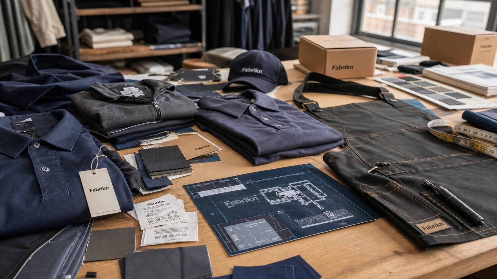
Premium Clothing Packaging Look with checks for samples, fit, MOQ, QC evidence, pricing terms, and delivery risk.
Fast answer: Premium Clothing Packaging Look: Box, Tissue, Insert, Finish, and Consistency should be judged by production evidence, not by a generic sourcing promise. The buyer needs sample proof, cost breakdowns, QC checkpoints, and delivery buffers in writing.
Ask for recent sample photos, measurement tolerances, fabric or print test assumptions, decoration test notes, packing examples, and a named inspection checkpoint. These details show whether the team can repeat an approved sample at bulk volume.
Separate garment cost, decoration, labels, packaging, sampling, testing, freight, and rush charges. When every cost line is visible, it becomes easier to reduce colorways, adjust size depth, or reserve more time for sampling.
A box can win a sale before a sleeve ever comes out of it. Buyers make a quality judgment in seconds, which is why how to make packaging look premium for clothing starts with the first thing people see and feel. In factory audits across Turkey, Portugal, Vietnam, and China, I’ve watched the same 320 GSM French terry hoodie shift from “solid” to “cheap” because the pack used a loose mailer, thin tissue, and a crooked label.
The numbers are blunt. A rigid carton that costs £1.20 can read more expensive than a £4.00 box if the cheaper pack has crisp edges, a tight lid, and a calm print palette. A high-cost box with weak glue, glossy flood printing, and a half-centimeter gap at the flap looks worse than a basic structure with disciplined finishing. I’ve seen brands spend £6.50 per unit on packaging and still look mid-market because the parts did not fit each other.
Channel changes the rules. In DTC, the parcel itself is the storefront, so the unboxing needs a clean reveal, a snug fit, and enough protection to survive 2 to 4 transit handlings. In boutique wholesale, the outer pack matters less than the way it stacks on a shelf, where symmetry and logo restraint carry more weight. For department-store buying rooms, sample presentation can outweigh decoration, because buyers open 20 to 50 units in a day and remember efficiency.
The mistake I see most often is simple: brands make the garment feel discounted by overpacking it. Oversized mailers, clingy tape, mismatched whites, and low-resolution logos create a sense of liquidation even when the product is good. Last year I worked with a brand selling £68 shirts and £220 tailoring pieces; they switched from a noisy printed box to a tighter kraft carton with one debossed mark, and perceived quality rose in store feedback within 6 weeks.
Premium does not mean expensive. It means controlled, deliberate, and consistent. For clothing packaging solutions, the packaging should echo the price point, not fight it. A £24 tee does not need a magnetic closure. A £480 blazer does need structure, weight, and visual quiet. That difference sounds small. It changes conversion, return sentiment, and the way customers talk about the brand.
Structure is the first luxury cue people feel with their hands. A rigid box, drawer box, fold-flat carton, or reinforced mailer tells the customer the brand planned the experience instead of improvising it. In a Shenzhen factory, I held two packs for the same sweatshirt. One used a 1.5 mm rigid board with a 0.5 mm wrap, the other a standard corrugated mailer. The rigid pack felt 3 times heavier and looked twice the price, even before the print was discussed.
Edges matter more than decoration. Straight corners, tight closure, and symmetry signal discipline. A drawer box with a 1-2 mm tolerance at the pull tab feels precise. A lid that rocks, a flap that bows, or a mailer that leaves 15 mm of empty space on each side creates visual waste. Waste reads cheap, even if the BOM is not.
Size discipline is the part many brands ignore. Oversized packaging suggests excess stock, excess freight, and weak attention to detail. A tee pack should move within a 5-10 mm margin, not swim in a box built for a knit set. For swimwear or accessories, smaller formats usually look sharper because the contents are lighter and the package can be more exact. Tailoring needs more structure. Knitwear benefits from a firmer board. Tees need compactness. If you are working with clothing packaging solutions, ask the supplier or manufacturer to size the dieline to the folded garment, not the largest item in the range.
The thing nobody tells you: some of the most luxury-feeling packs use fewer components, not more. A single well-sized carton with one insert and one tissue layer can look more expensive than a box, sleeve, sticker, ribbon, and card piled together.
I have seen this again in Italy and Bangladesh. The most convincing packs were often the simplest, especially for premium knitwear and tailoring. Too many layers slow packing lines, raise the chance of misalignment, and add 8 to 15 seconds per unit on the table. That hurts both quality and cost. A good factory or supplier will usually recommend the simplest construction that still protects the garment during production, bulk packing, and transit.
Material choice is where premium perception either locks in or falls apart. Heavy SBS board in the 350-450 gsm range gives cartons a clean, bright face and a crisp fold. Uncoated kraft can also look elevated, but only when the print is restrained and the structure is exact. Specialty wraps, cotton-texture papers, and lightly mottled recycled stocks create tactility without shouting. The tactile cue matters because customers infer value from resistance, not just color.
Finish is where brands often overdo it. Foil stamping can add £0.18-£0.60 per unit depending on coverage and tooling. Embossing and debossing often add £0.10-£0.35. Spot UV may add £0.08-£0.22. Soft-touch lamination can lift perceived luxury, but it also brings scuff risk and can increase unit cost by 12-25 percent on small runs. Stack foil, embossing, soft-touch, and full-surface print together, and the result can look promotional rather than premium. Too much shine feels like a cosmetics launch, not a clothing label.
I track finish choices by category. Tailoring and occasionwear usually benefit from matte surfaces, deep ink density, and one controlled tactile moment, such as a debossed logo. Streetwear can handle a bolder foil or an exposed kraft stock if the graphic language is tight. Luxury basics often look best with almost no finish at all, just impeccable production. According to ISO packaging and print standards help brands keep consistency on board strength, glue performance, and tolerances, which is where many “premium” packs quietly fail. For traceable material programs, brands can also review guidance from OEKO-TEX and Textile Exchange.
MOQ matters because finish choices change supplier behavior. A short-run digital print order at 500 to 1,000 units may allow more color flexibility, but foil and embossing usually become economical only from 1,500 to 3,000 units. A long-run offset job at 5,000 plus units brings better color control, though it demands stronger proofing. I’ve seen brands save 18 percent by dropping a secondary finish and putting that budget into better board stock instead.
Sustainability can still look elevated. Recycled content works when the fiber is clean, the ink is dense, and the construction is tidy. Water-based inks on uncoated stock often look more expensive than a laminated pack with a recycled label slapped on top. The trick is not to signal “eco” so loudly that the pack becomes visually thin. Premium recycled packaging feels substantial, calm, and accurate.
Budget packaging is not about cutting every cost. It is about choosing the right 20 percent of spend that changes 80 percent of perception. I usually map a ladder like this: basic mailer at £0.18-£0.45, branded label at £0.03-£0.08, printed tissue at £0.05-£0.14, custom insert at £0.12-£0.35, rigid box at £0.85-£2.50, premium finish at £0.10-£0.60. Brands that move one rung at a time usually spend better than those that jump straight to a magnetic box.
For DTC basics priced at £25-£60, packaging often works best at 2-4 percent of order value. Mid-market apparel at £80-£180 can handle 3-6 percent if the pack is used to reinforce positioning. Luxury labels above £200 may spend 5-10 percent, but only if the pack is part of the brand ritual and not just decoration. I’ve seen brands over-invest in boxes for low-AOV products and end up depressing margin by 1.5 to 3 points.
The money usually leaks in familiar places. Oversized boxes increase dimensional weight and fill costs. Full-color printing on every surface adds little if the customer only sees two sides. Magnetic closures cost more, weigh more, and can trigger alignment issues in production. In contrast, tighter sizing, better board, and one clean finish usually improve perceived value faster than a pile of extras. If your factory offers private label clothing services, ask them to price packaging as part of the brand system rather than a separate vanity line item.
Regional sourcing changes the equation. Domestic short runs in the UK or EU can cost 15-35 percent more per unit than offshore volume production, but they also reduce sample loops from 3 weeks to 7-10 days. Offshore suppliers in Vietnam, India, or China can hit lower unit prices at 5,000 to 20,000 units, yet the freight and proofing cycle can erase some of that savings if the dieline is wrong. I have watched brands spend £900 fixing a size mistake that would have cost £120 to catch in prototype. For trade and landed-cost planning, the U.S. International Trade Administration is a useful authority on sourcing and import considerations.
The best return-on-investment upgrades are predictable. Spend on board quality first. Tighten the fit. Choose one premium finish. Control color. A well-run pack with a 350 gsm board, one debossed logo, and a correctly scaled insert can outperform a heavily embellished box in customer reviews, Instagram posts, and repeat purchase intent.
Recycled materials can look expensive when the stock is chosen properly. A 100 percent recycled board with clean fiber, sharp cutting, and high-contrast print often reads more credible than a shiny virgin board trying to imitate luxury. I’ve visited factories where a natural kraft carton with one black ink hit looked richer than a soft-touch lamination because the proportions were better and the structure was stable. Premium is often a matter of discipline, not gloss.
There is a trade-off, though. Plastic-free packs reduce waste, yet they can weaken moisture protection and raise return damage in wet transit. For knitwear and T-shirts, that may be acceptable. For tailored jackets, silk, or baby clothing, protection matters more because returns are expensive and stains or creasing are harder to recover from. If you work in newborn or toddler lines, the requirements are even stricter, which is why brands often pair apparel packaging with custom baby clothing manufacturing standards on cleanliness, labeling, and low-toxicity inks.
Compliance cannot be fuzzy. Verify FSC or PEFC chain-of-custody where relevant, recycled content claims, and ink or coating declarations from the supplier. Data from Textile Exchange shows that brands are being pushed to prove material claims with documented sourcing, not marketing language. Greenwashing often sounds vague: “eco-friendly,” “planet-safe,” “sustainable packaging,” with no percentages, no certificate, and no test report. I ask for the paper spec, adhesive type, and the supplier’s documentation before I approve a pack.
Transport and storage can undo a good design. A premium box that doubles freight cube is not premium. A heavy rigid pack that arrives crushed after 6,000 miles of transport is not premium either. I prefer packaging that stacks efficiently, tolerates warehouse handling, and survives 2 to 3 drops without visible corner damage. The ideal pack looks good, ships well, and stores flat when possible.
Minimal packaging often looks more premium than ornate packaging when the proportions are right. A single sleeve, a precise fold, and one clean insert can outperform three decorative layers. That is especially true for brands with modern tailoring or understated luxury basics.
Typography changes price perception fast. A thin serif used carelessly can feel outdated; a heavy grotesk can feel blunt. The best premium packs use letterspacing, hierarchy, and margin with restraint. I’ve seen a logo placed 8 mm too high on a carton shift the entire perception from refined to amateur. Ink density matters too. A rich black should stay rich across 1,000 units, not turn muddy after the first press adjustment.
Color is not decoration. It is positioning. Premium apparel usually works with one dominant neutral, one accent, and a controlled amount of contrast. Cream, charcoal, navy, and muted olive are safer than a rainbow of seasonal tones. Loud graphics can work for youth brands, but for premium shirting, tailoring, or knitwear they often reduce the sense of quality. The customer should feel calm before they see the garment.
Inside the pack, the sequence of reveal does the selling. Tissue wrap should close cleanly with a sticker that actually sticks. Garment cards should sit straight, not float. Fold precision matters because creases telegraph effort. A pocket square folded 2 mm off center looks careless. A sweater collar crushed under a too-small insert looks worse. When I visited a cut and sew facility last spring, I saw a 1,200-unit run rejected because the insert was 6 mm too wide and split the box edge. If your production includes cut and sew manufacturing, packaging tolerances should be checked alongside garment tolerances.
Scent is risky. A faint, controlled scent can feel luxurious, but an overpowering one reads like a perfume counter. I would avoid it unless the brand has a clear sensory identity and the pack can hold scent consistency over 30 to 60 days.
Mistakes are usually small and visible: off-center logos, weak adhesive, mismatched whites between tissue and card, and inserts that do not fit. Those failures look trivial on a sample table. They look expensive once they reach customers.
My 30-day packaging audit starts with price point. Write down the garment’s retail price, margin target, and channel, then compare the current pack against that number. A £35 tee, a £95 knit, and a £260 blazer should not share the same packaging logic. Next, test the pack against damage rate, fit accuracy, and unboxing response. If the box costs £1.80 but the customer sees a £0.80 experience, the gap will show in reviews.
Ask suppliers for dielines, board specs, finish swatches, print proofs, and packed samples. Do not approve packaging from a PDF alone. I want the real thing in hand, because paper weight, glue behavior, and closure tension are impossible to judge on screen. If a supplier cannot turn a prototype in 7-14 days, that is a signal. Speed matters because launches slip when packaging waits behind garment approvals. In wholesale and bulk production, clear QA checkpoints also help the factory or manufacturer catch issues before the main run.
Test by segment and channel. A DTC customer may prefer a dramatic reveal, while wholesale buyers prefer efficient stacking and clean resale presentation. Measure damage rates on 100 units, gather return comments on 50 to 100 orders, and review social unboxing posts for recurring visual problems. Then revise. That is how to make packaging look premium for clothing without guessing. Not decorated. If you are sourcing custom or wholesale packaging from China, ask for small pilot runs before committing to bulk MOQ.
Start with tighter sizing, better board, and one finish rather than several. A 350 gsm to 450 gsm board, a single deboss, and correct dieline dimensions often improve perception more than adding ribbons or magnetic closures. For many DTC brands, that keeps packaging near 2-4 percent of order value.
Basic branded mailers can sit around £0.18-£0.45 per unit, while rigid boxes often run £0.85-£2.50 before shipping and warehousing. Foil, embossing, or soft-touch lamination can add £0.08-£0.60 depending on coverage and run size. MOQ also matters, with 1,500 to 3,000 units usually pricing better than 500-unit prototypes.
Use recycled board with clean fiber, water-based inks, and minimal coatings. A restrained kraft or recycled SBS carton often looks more premium than a laminated pack that is trying too hard. Ask for FSC or PEFC documentation and written claims with percentages, not vague “eco” language.
Typography, color restraint, fold precision, and insert fit usually matter most. Off-center logos, weak adhesive, and mismatched whites are the mistakes customers notice immediately. A tidy reveal with tissue, one sticker, and a straight garment card often outperforms layered decoration.
A practical timeline is 30 days for concept to approved sample, then 7-14 days for final revisions if the supplier is responsive. Freight and production can add 2-6 weeks depending on region and volume. Domestic short runs are faster; offshore volume runs usually need more proofing time.